An Addition True to the Times
PROJECT OVERVIEW
This family home came to us chock full of curb appeal, but lacking the breathing room that this busy family - abounding with sisters, cousins and friends - desired. More than a place to cook, for this family the kitchen was a gathering spot. Enter, the Scovell team. We live for the space planning element of the project! Not only does it kick off the whole process, but it’s where the team sees into all of the possibilities and untapped potential.
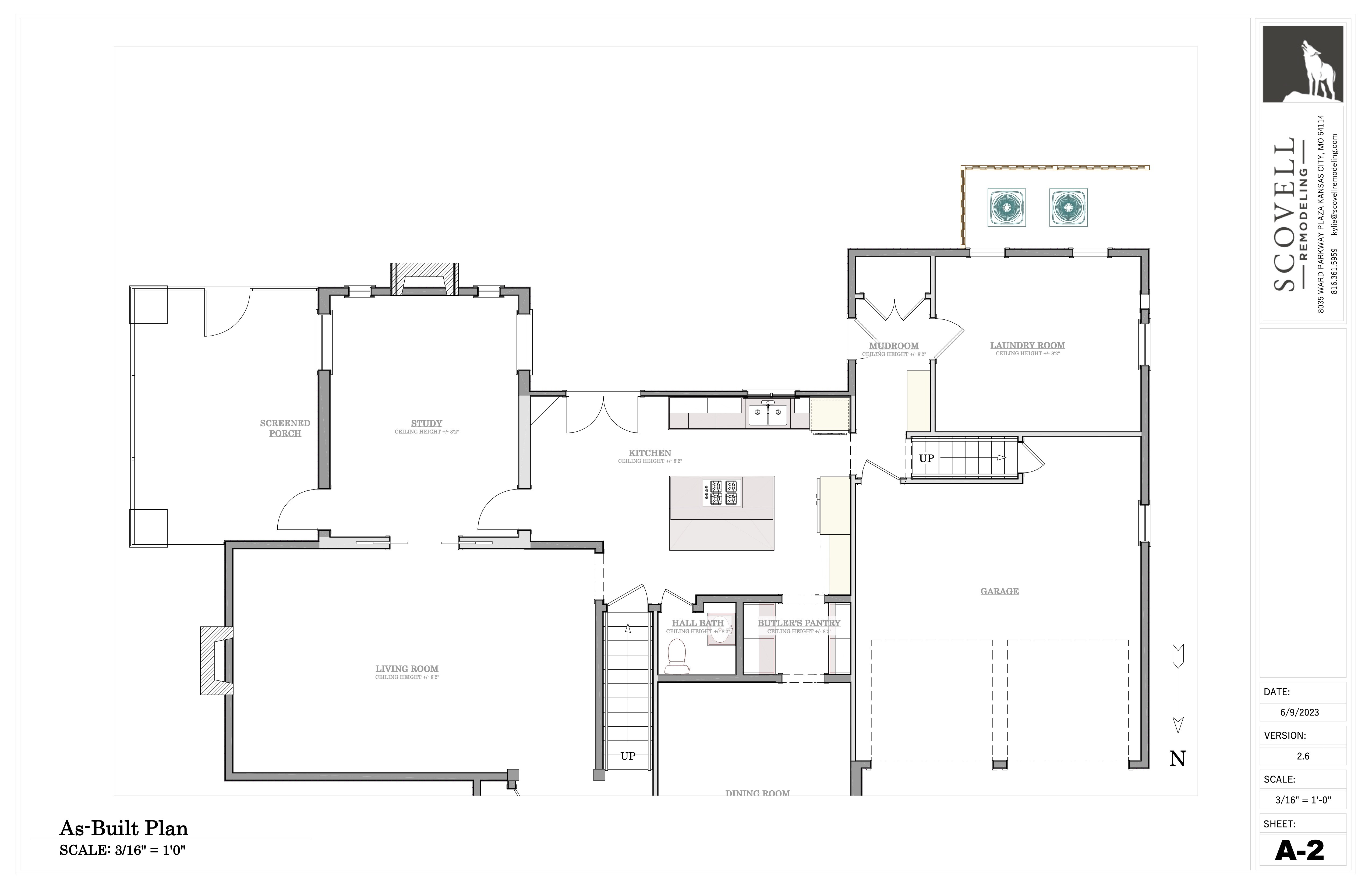
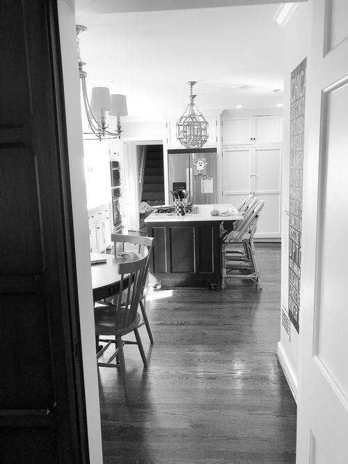
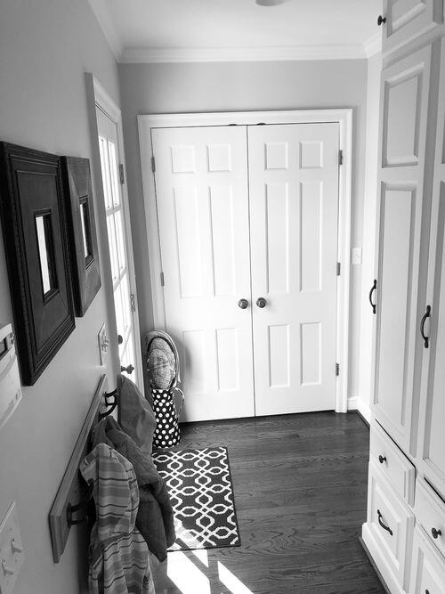
The kitchen was the main point of tension. The seating areas were cramped, the storage limited and the layout not fit for entertaining. A mudroom for this age of home was rare and a welcome sight, but it was tucked into a tight back hall while the laundry room on the other side of the wall was unnecessarily spacious.
THE SOLUTION
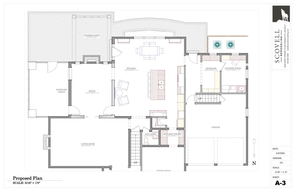
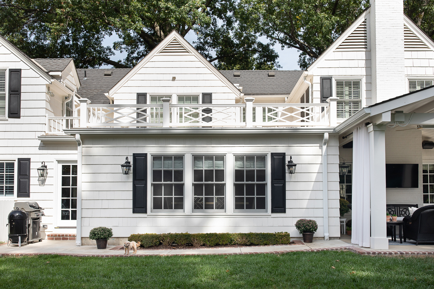
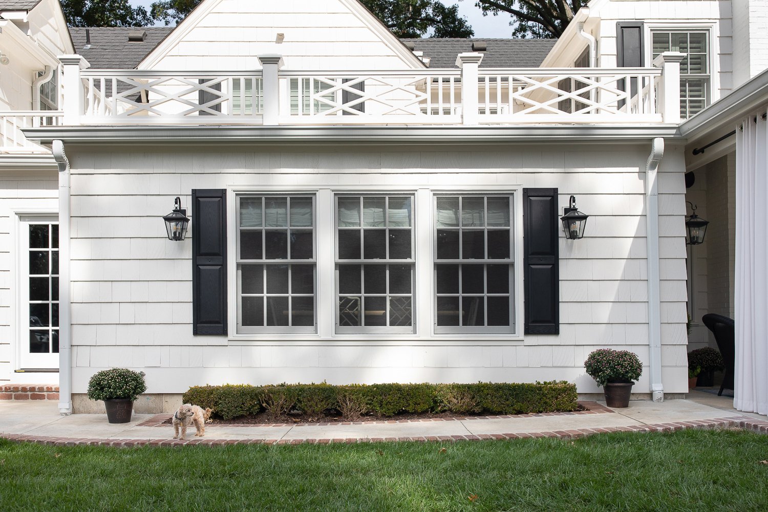
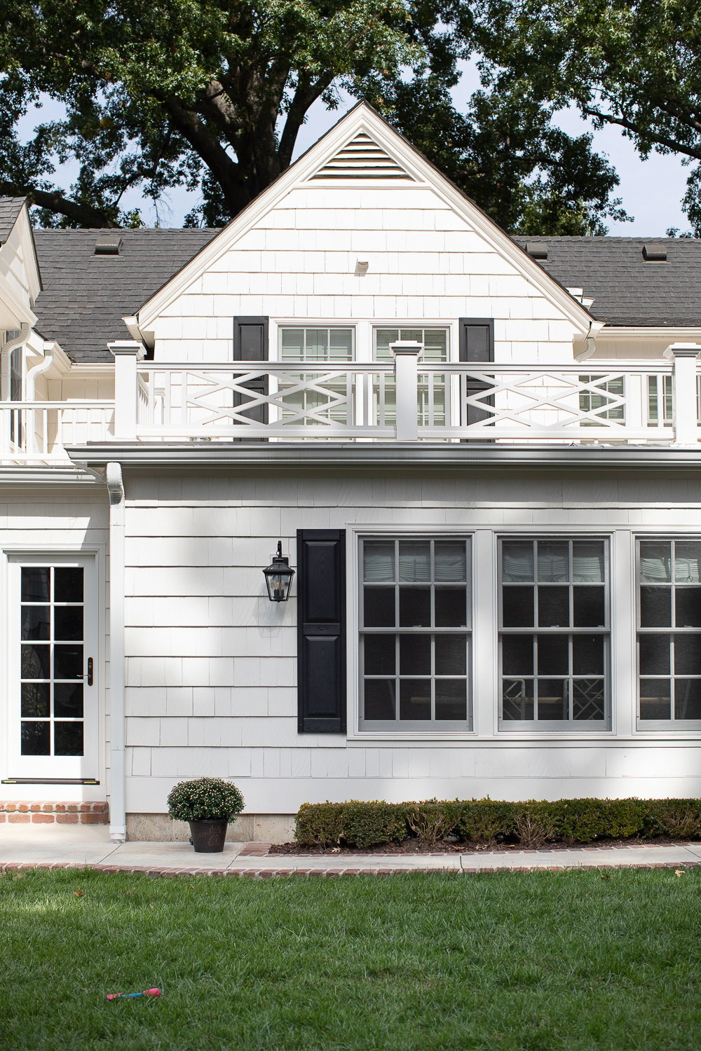
The only solution for more space was to go out! The back of the house was bumped out to nearly triple the size of the kitchen, and the laundry and mudroom sizes were adjusted to divide the space more logically. The hallway from the garage was opened up to serve as a generous passthrough serving the mudroom and kitchen as well direct access to the backyard grill.
With this project in particular, the “before” truly wasn’t bad, in fact, it was perfect when their family was just beginning to grow. Knowing they wanted to make it their forever home, they wanted to bite the bullet sooner rather than later on turning it into a true dream space. But, if we were going to tear out spaces that were already pretty decent, it had to be absolutely worth it. And they agreed that to be worthwhile they wanted to gain a covered patio out of the deal. So covered patio we did build!
DESIGN CONCEPT
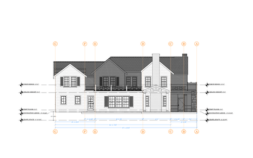
Elevations are always part of our design process but when we’re doing an addition they’re increasingly important! Exterior elevations help the design team plan for every detail and provide the production team with visual instructions for every element of the design.
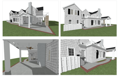
The renderings don’t exactly do it justice, but they’re certainly helpful for envisioning the final product.
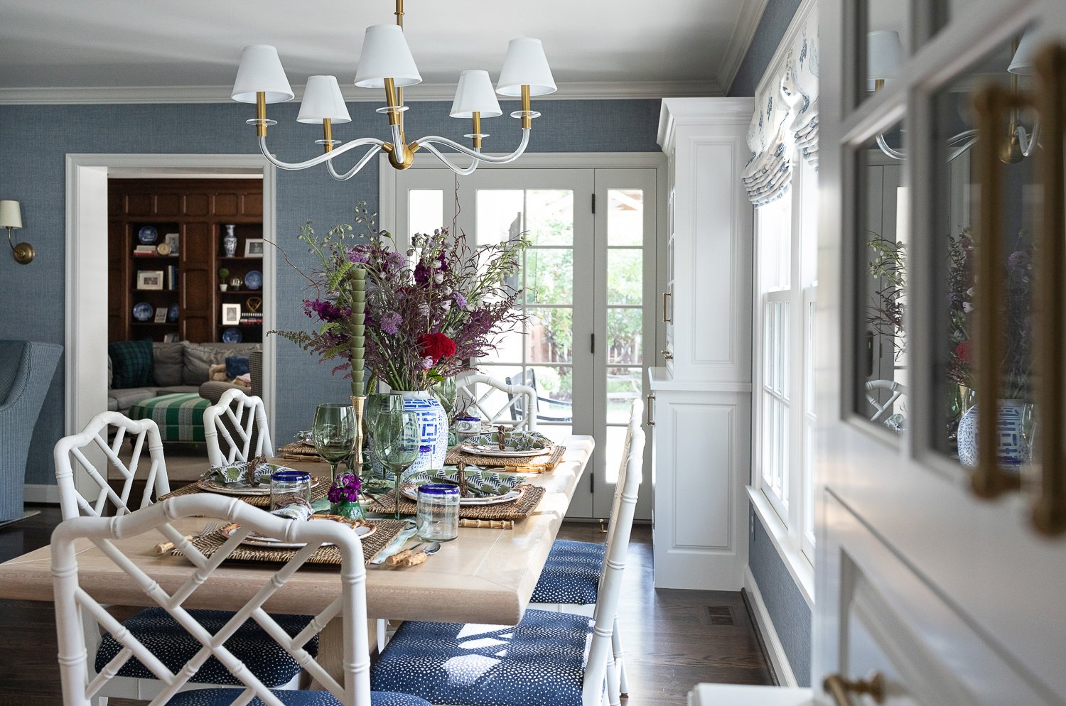
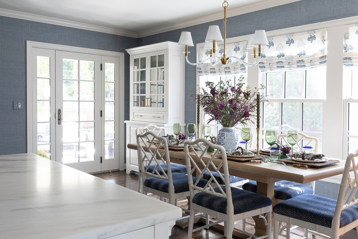
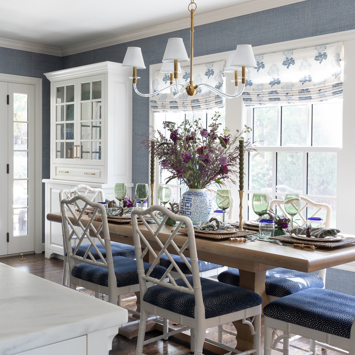
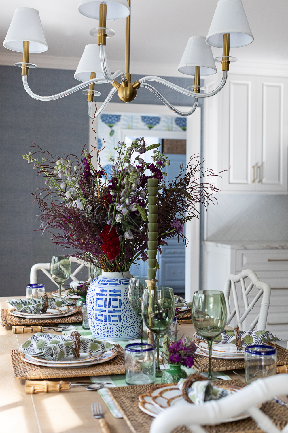
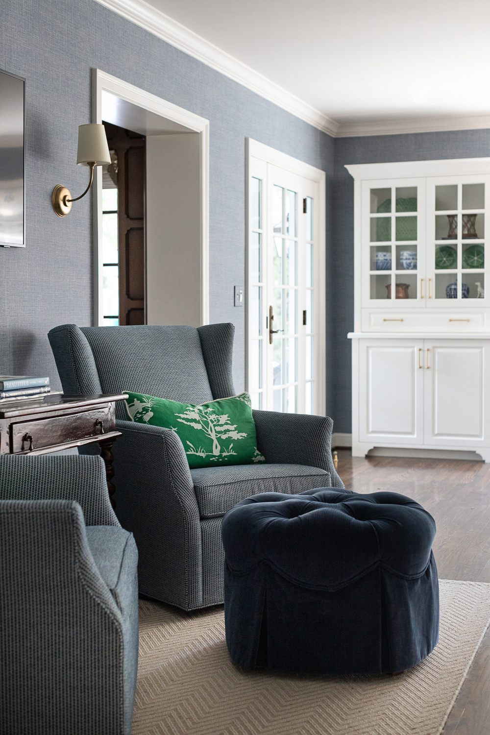
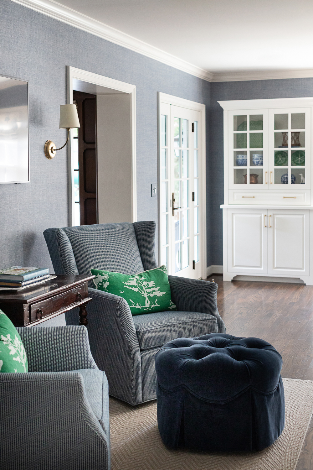
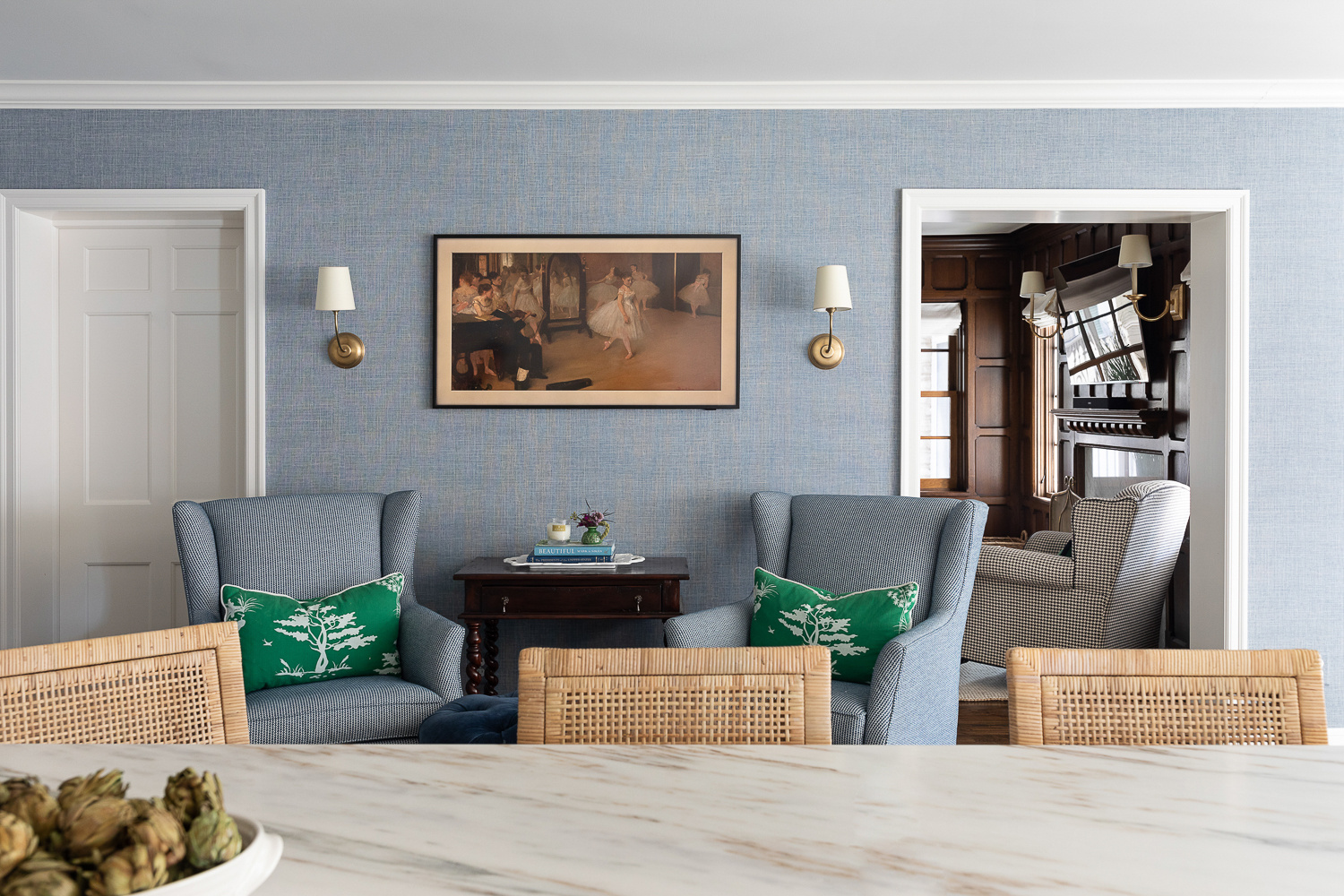
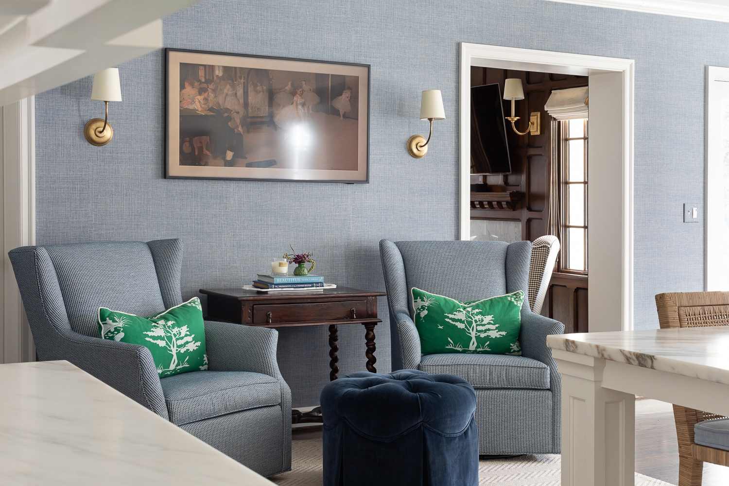
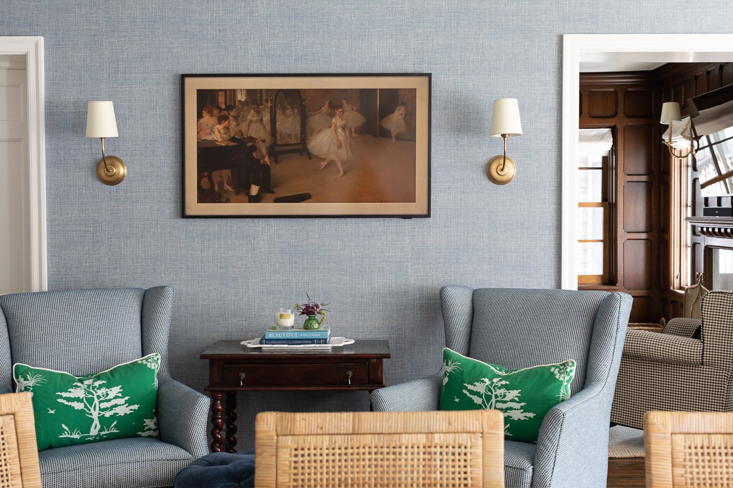
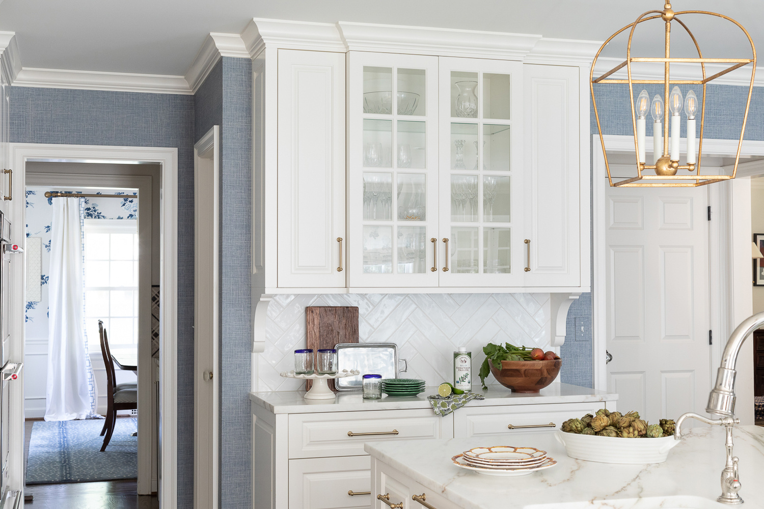
Of course, just as much planning went into designing the interior spaces. Not only did the new kitchen layout accommodate ample storage and counter space but plenty of seating options as well: counter stools at the island, seating for six at the breakfast table and a set of swivel chairs for cheering on the cook.
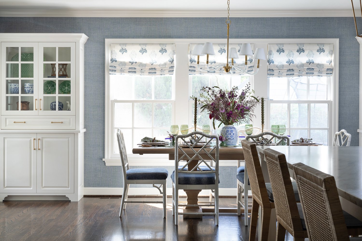
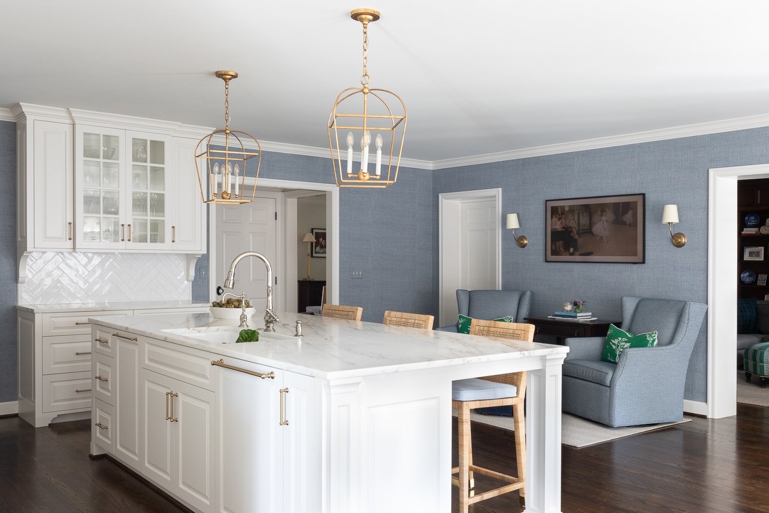
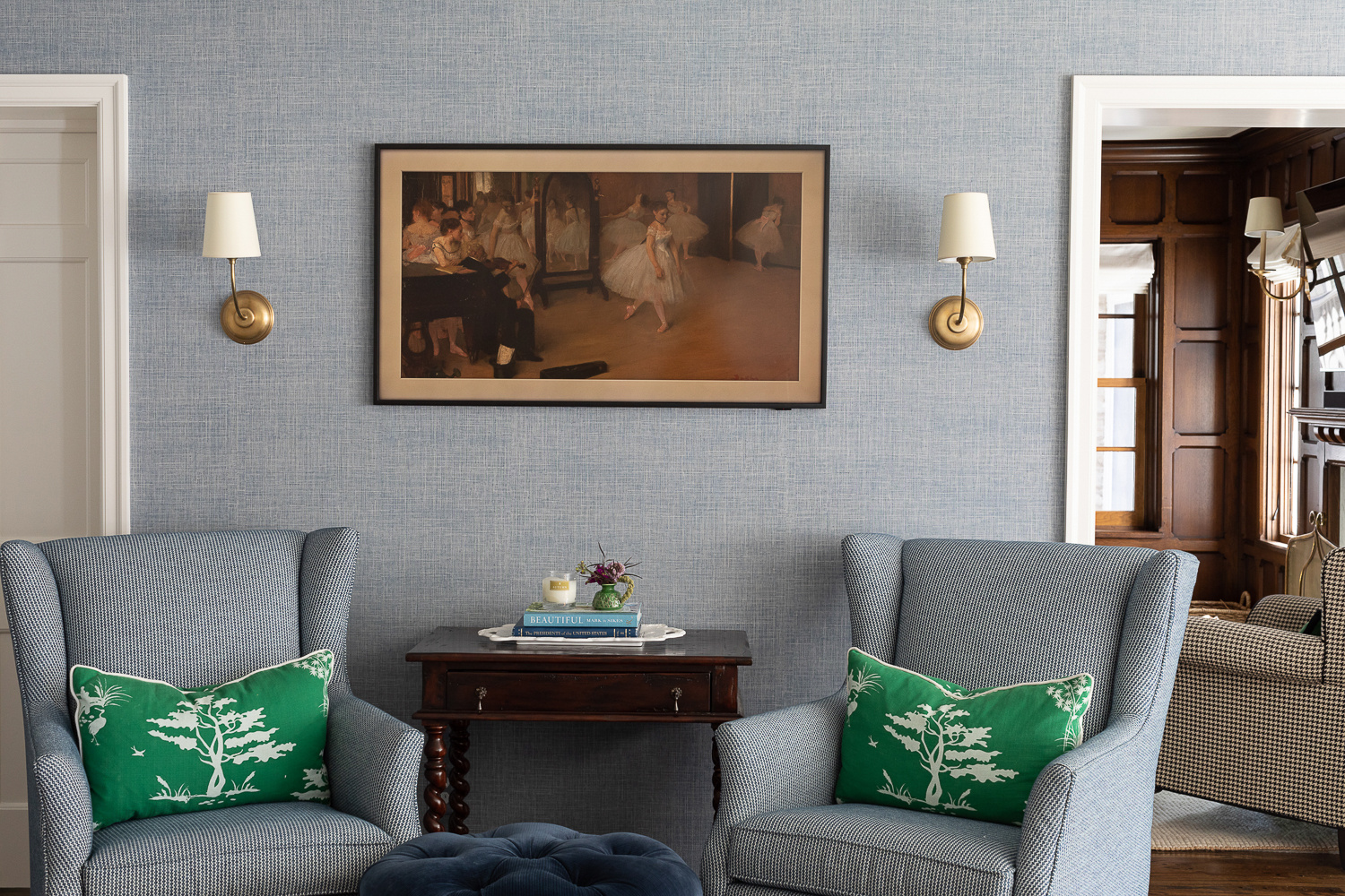
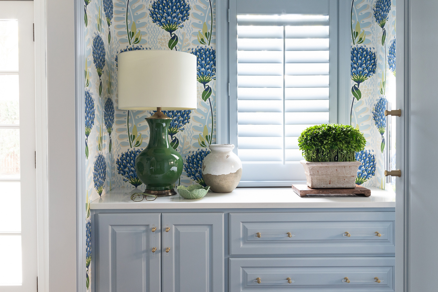
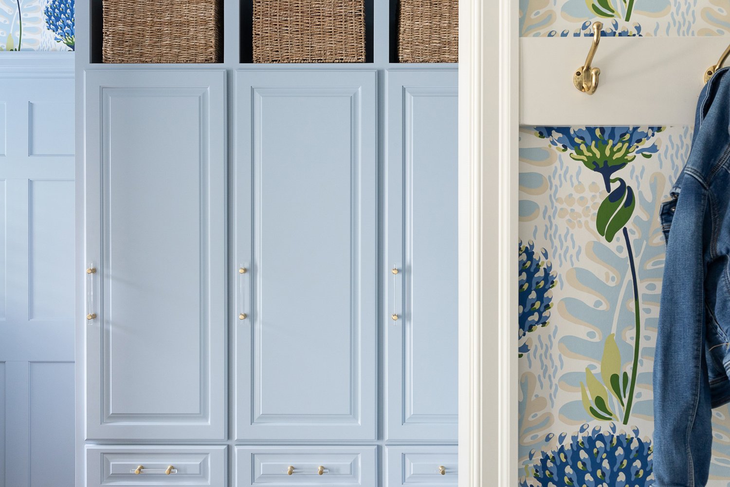
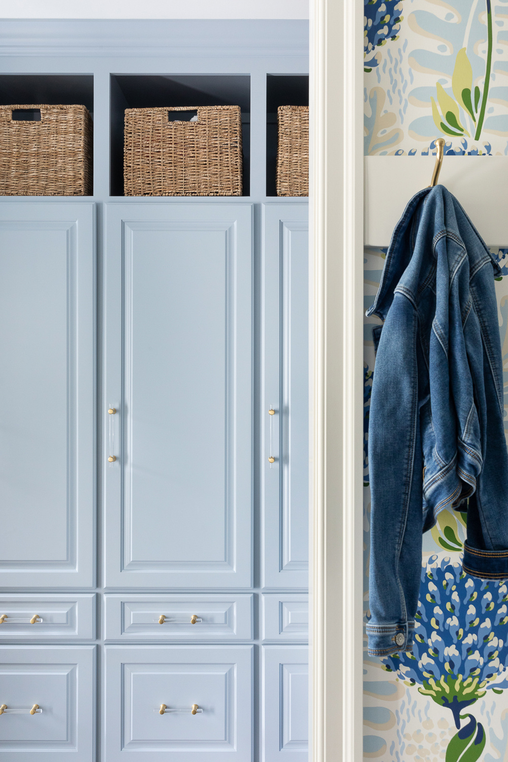
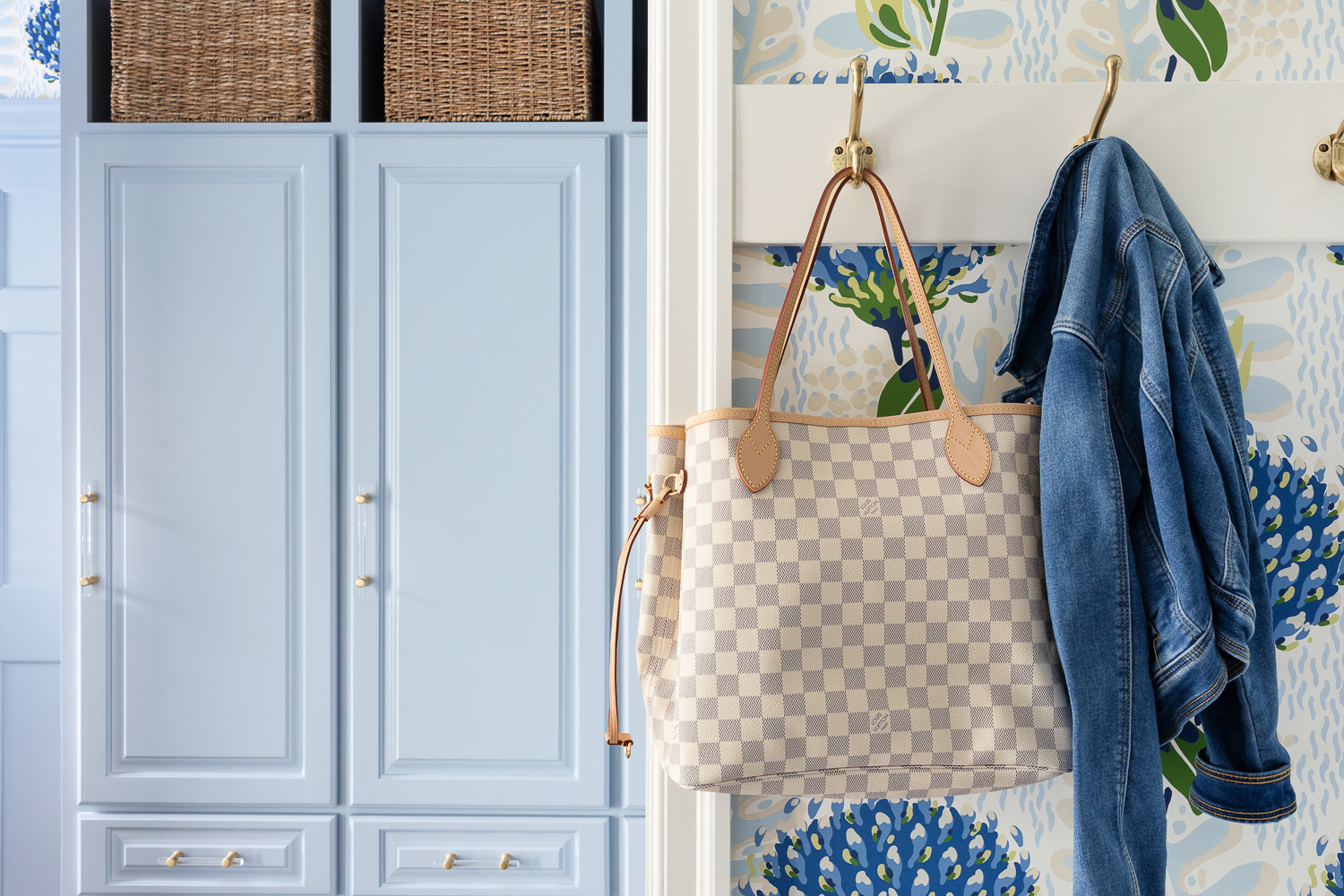
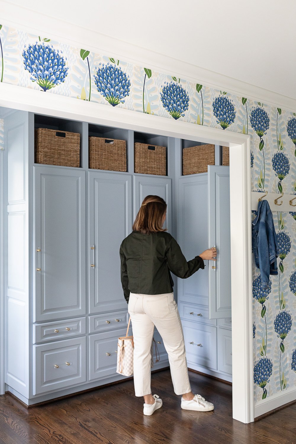
Just across the hall from the kitchen you’ll find the mudroom - complete with lockers for each family member and a wrapping station fit for a gift-gifting queen! The laundry room and desk area are tucked away behind a door for a sound barrier to the ever-running machines.
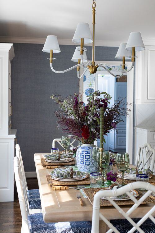
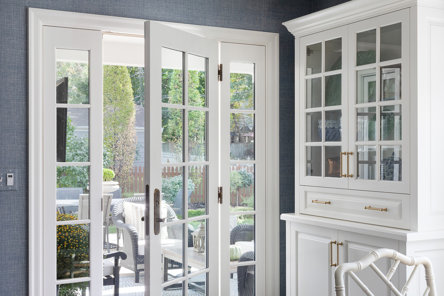
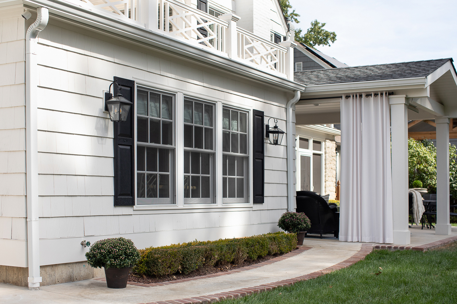
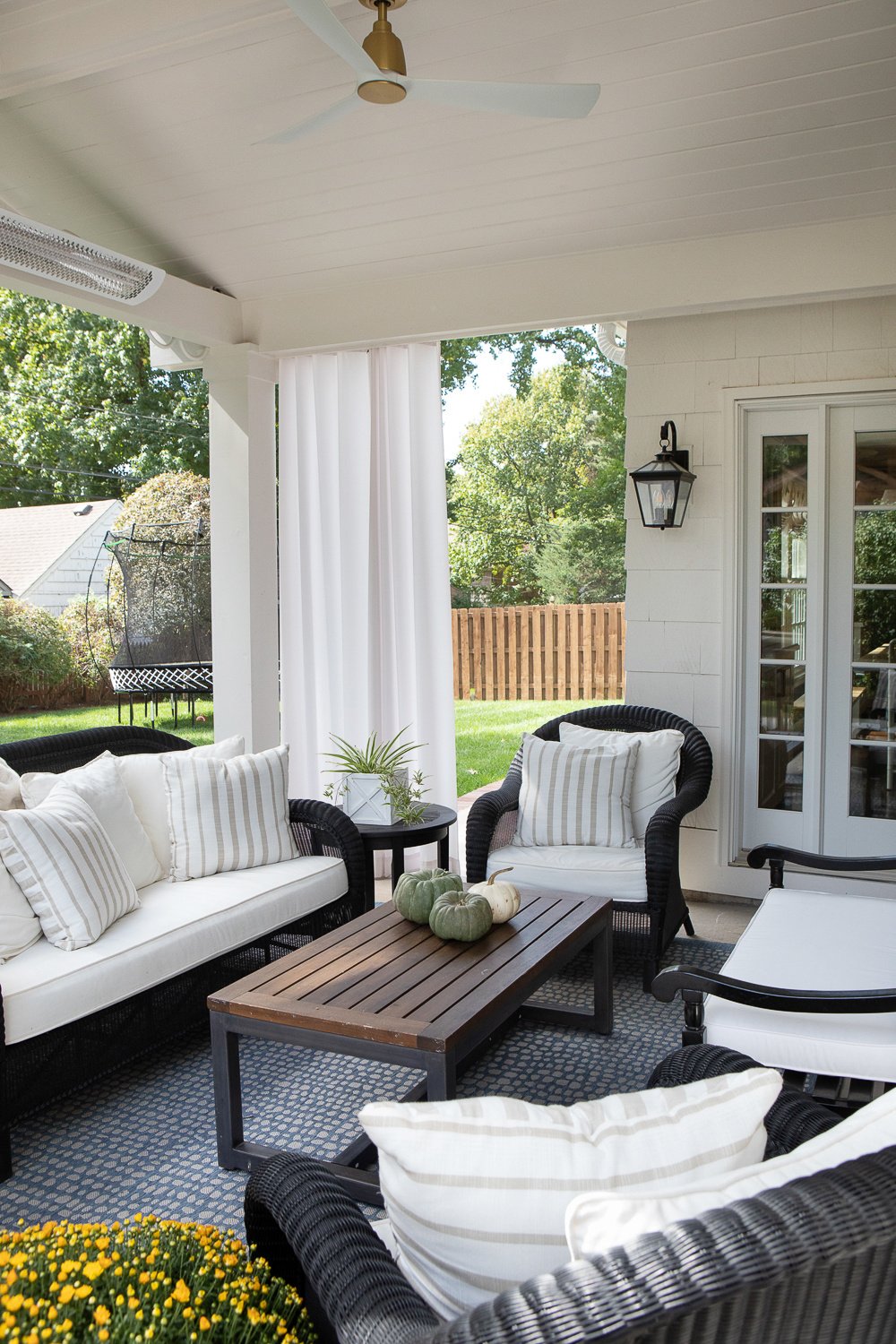
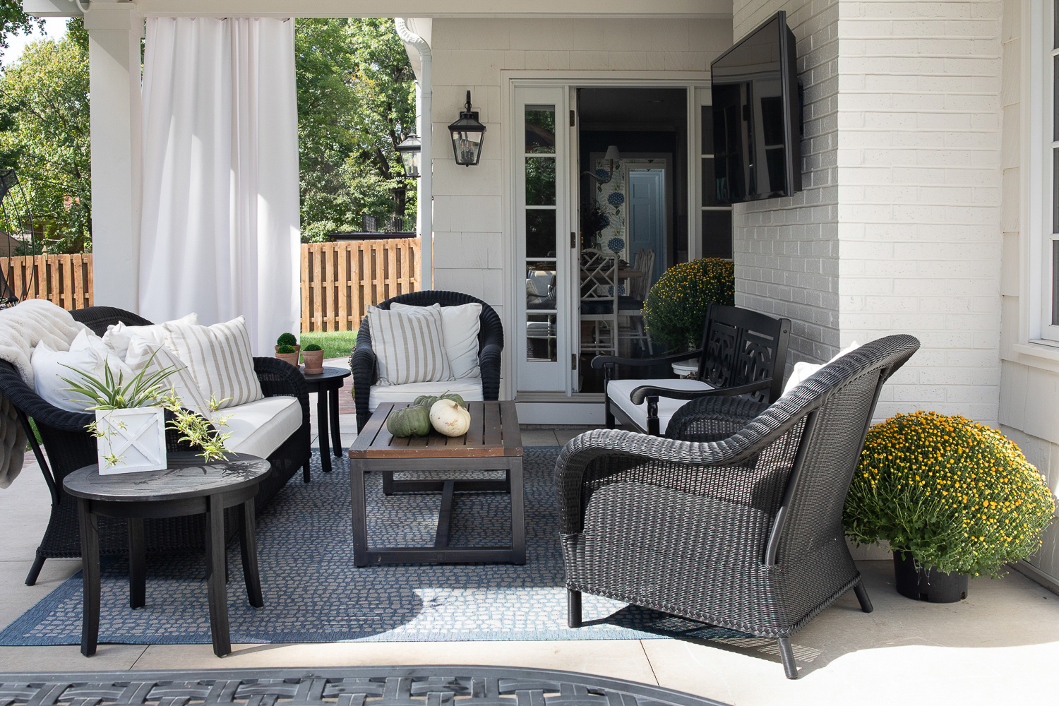
Beyond the dining area lies the lovely covered patio. Outfitted with a TV, plush seating area and situated right off the kitchen it’s the perfect set-up for entertaining!
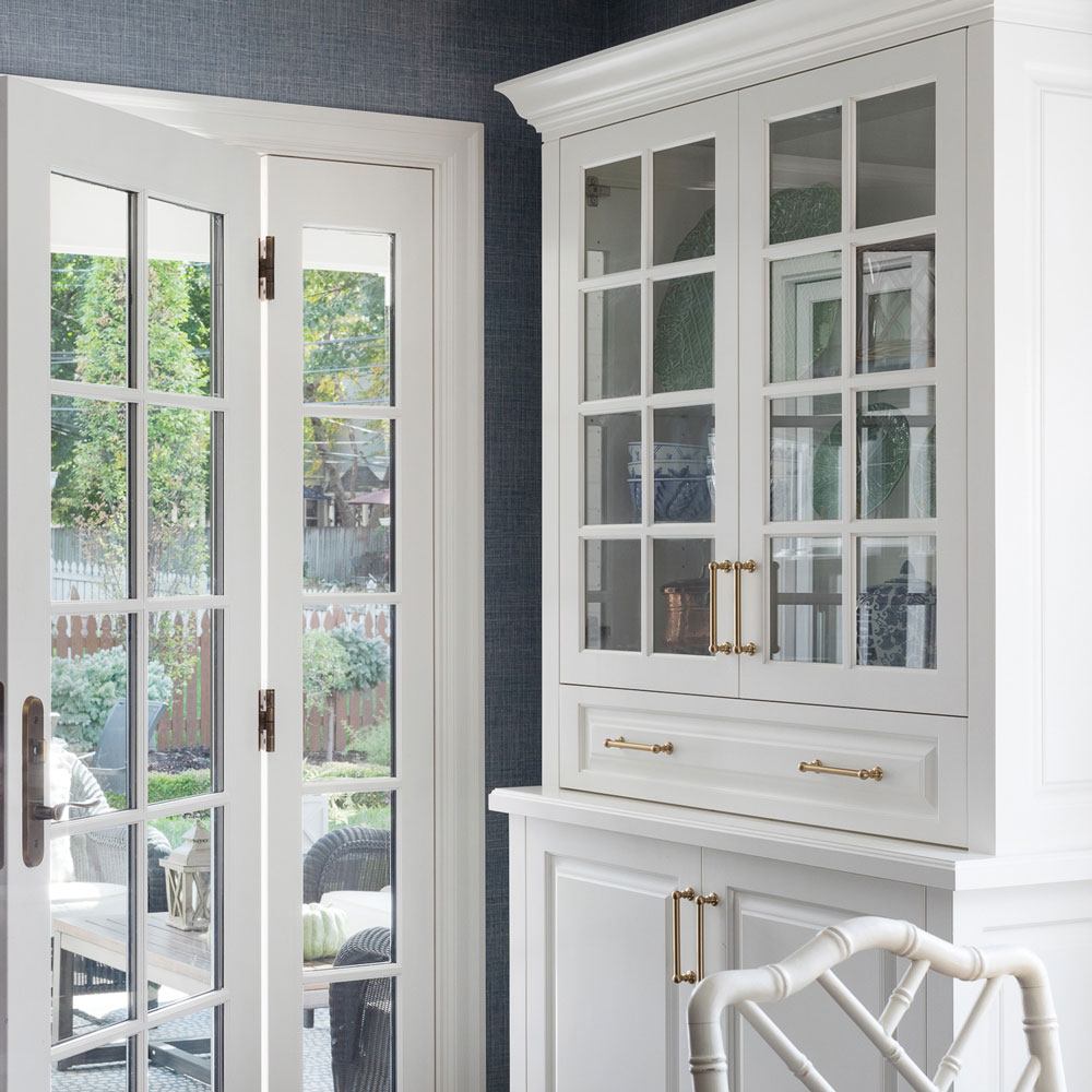
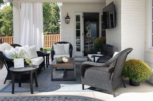
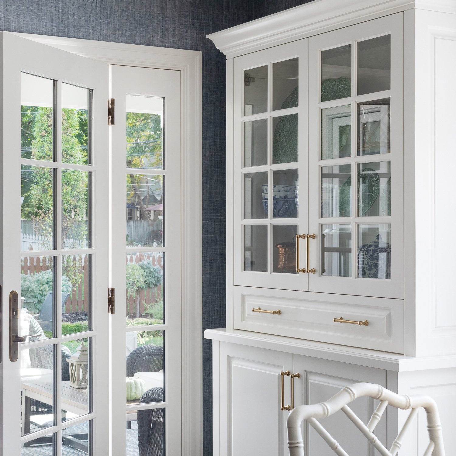
The goal for our designs is to always appear original to the home. We never cut corners on materials - even when it’s the back of the house - and no detail is overlooked. We love how integrated and natural the porch looks from the inside out!
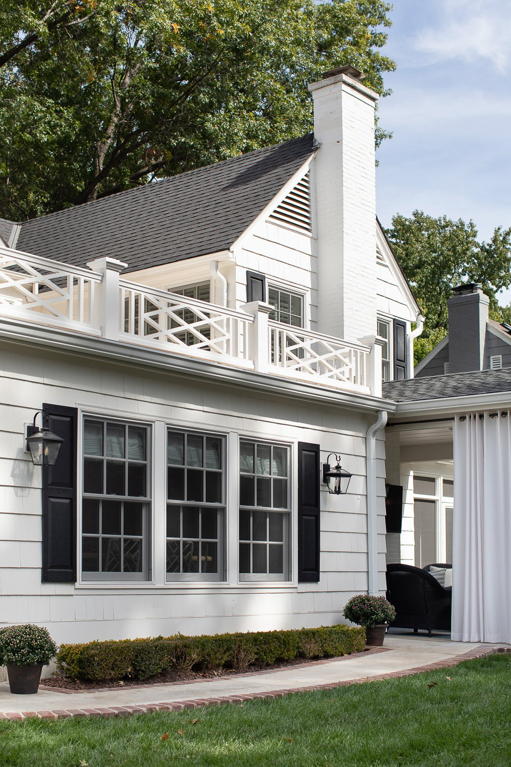
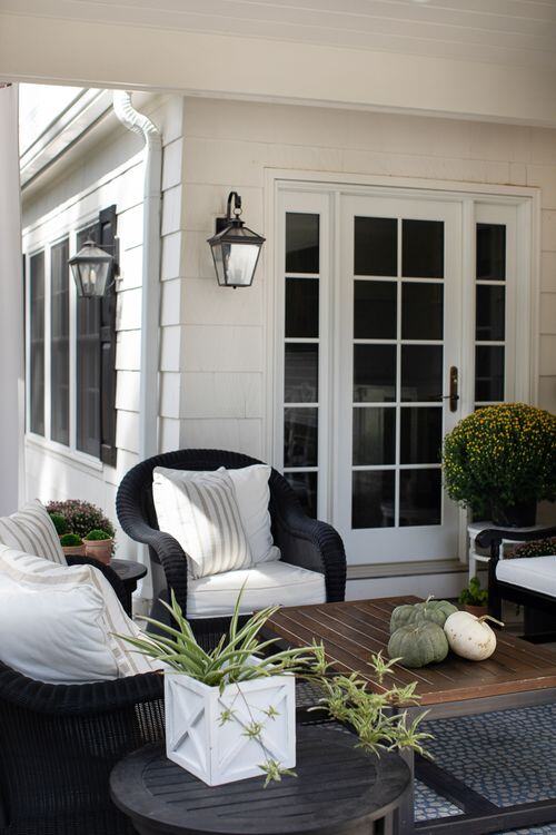
A bigger kitchen plus a covered porch? Definitely a win-win.
-
Reclaim and Relax
-
Curb Appeal
