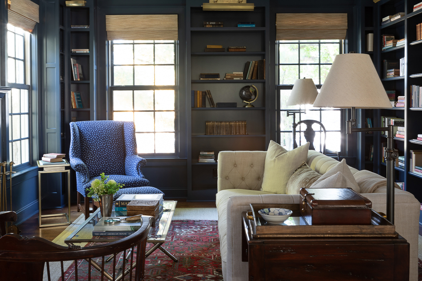
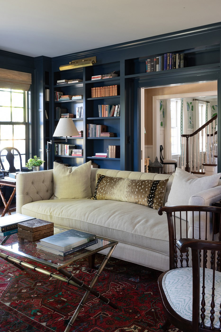
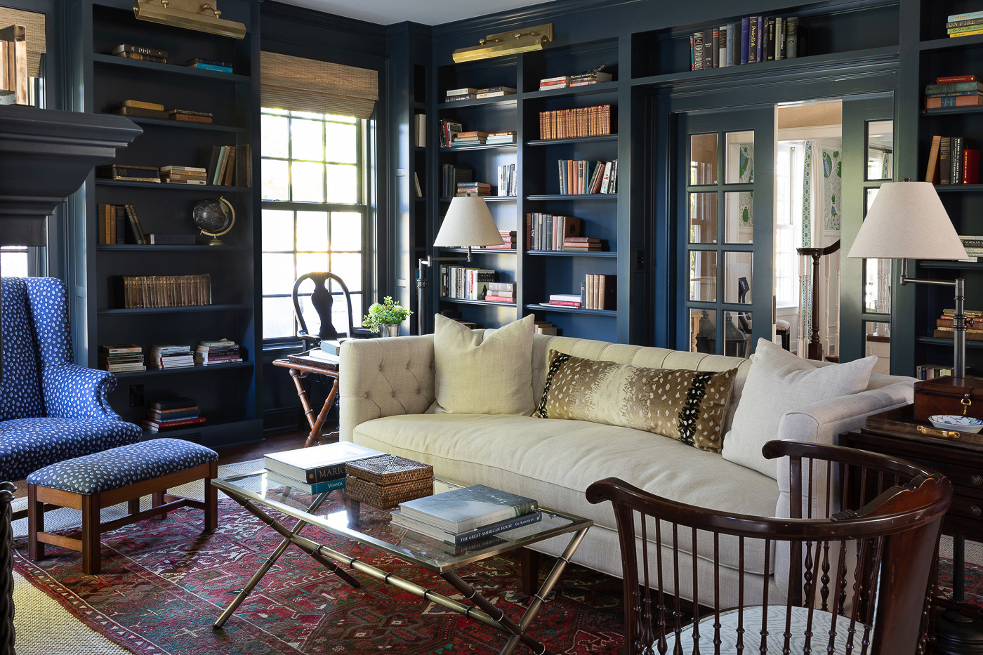
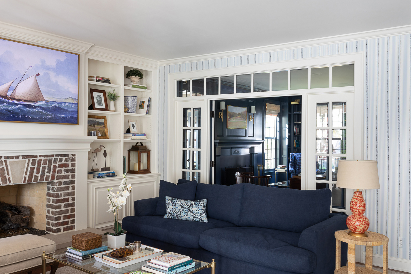
A Dark and Moody Library
PROJECT OVERVIEW
We normally handle all the design services for our clients in-house with our super talented designer but occasionally the homeowner themselves happens to be a super talented designer. Such was the case on this project when we partnered with the wonderful Michelle Oettmeier. If you've seen the study we shared on her kitchen, you may recall these folks moved a whopping 30 feet one door down from their old house.
While this new house was an upgrade in so many ways, there were a few rooms they were sad to leave behind. So we recreated their library with a twist. Here’s a picture of their old house’s library.
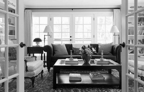
THE SOLUTION
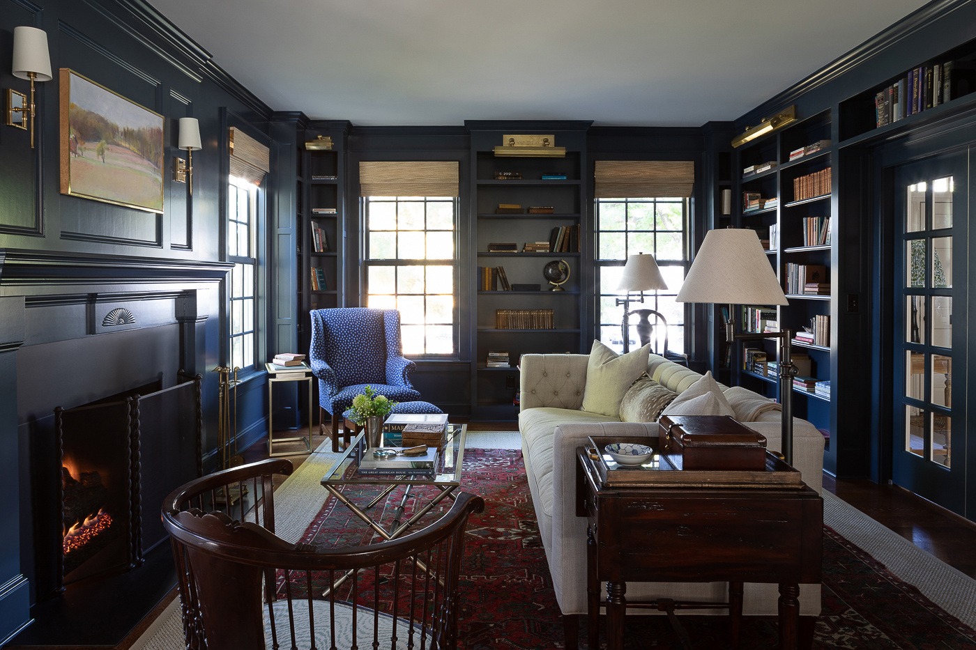
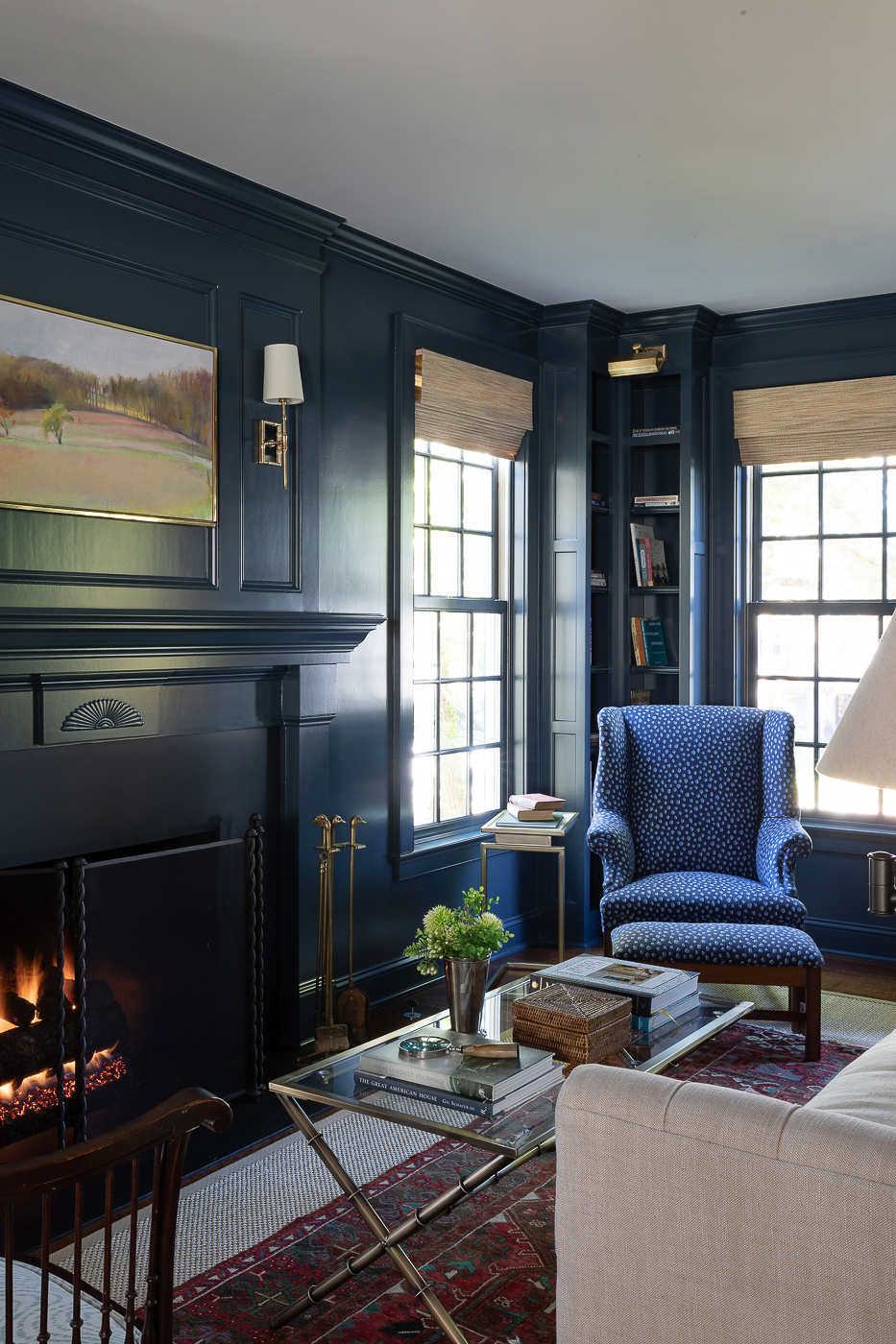
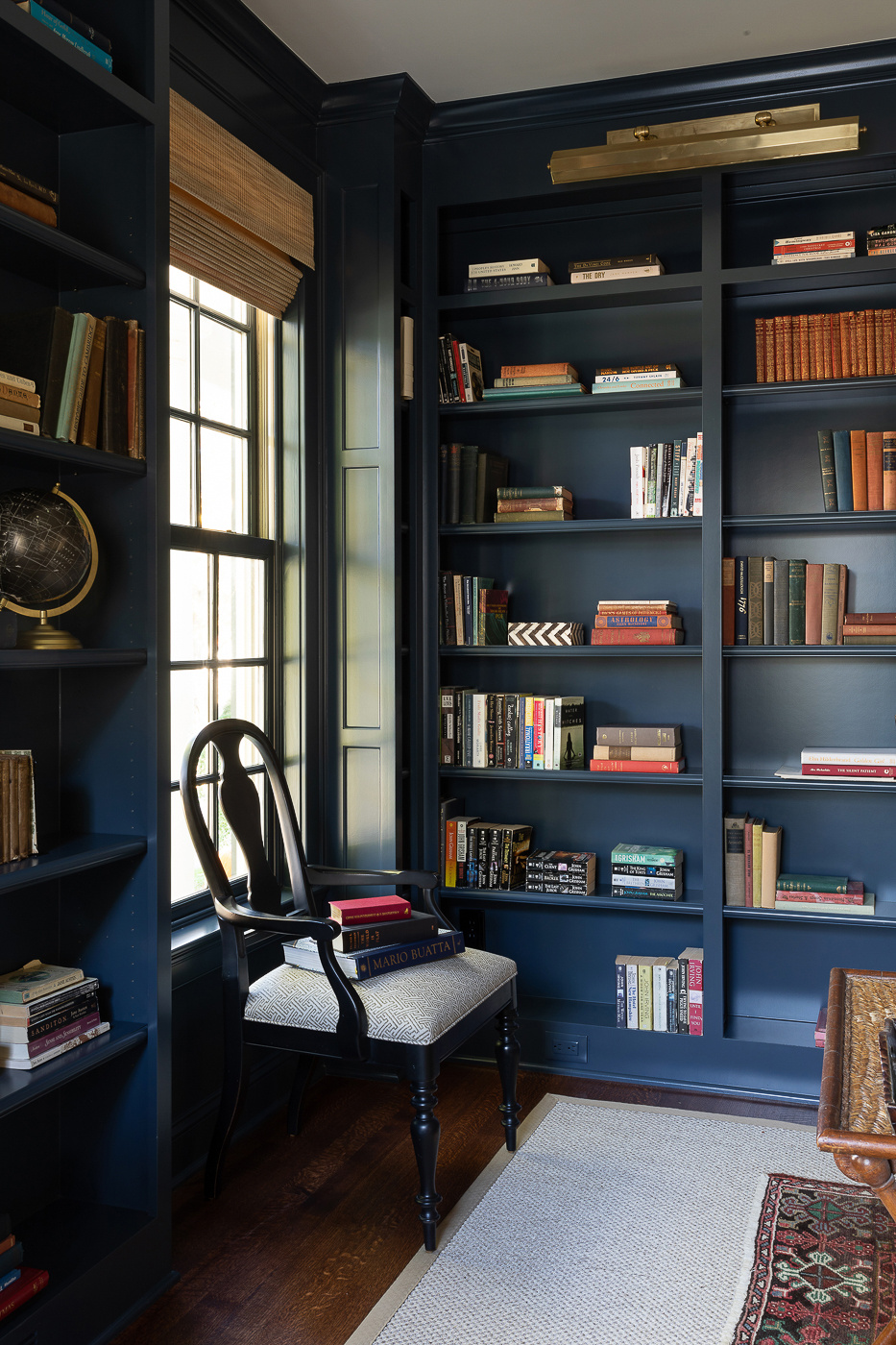
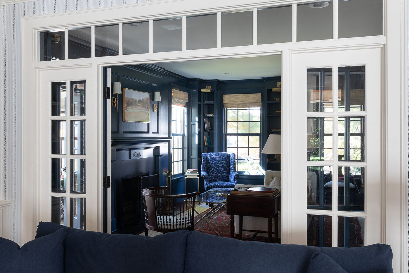
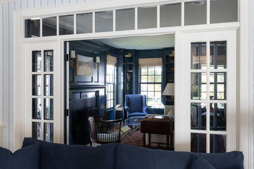
This time we kept the same concept of library lights and wall to wall shelving, but our client darkened up the mood with a deep paint color on the cabinets and the walls. To further the cozy feel we shrunk the entry point a bit and rebuilt the wall to accommodate a pair of french doors. Here’s what it looked like just after we began.


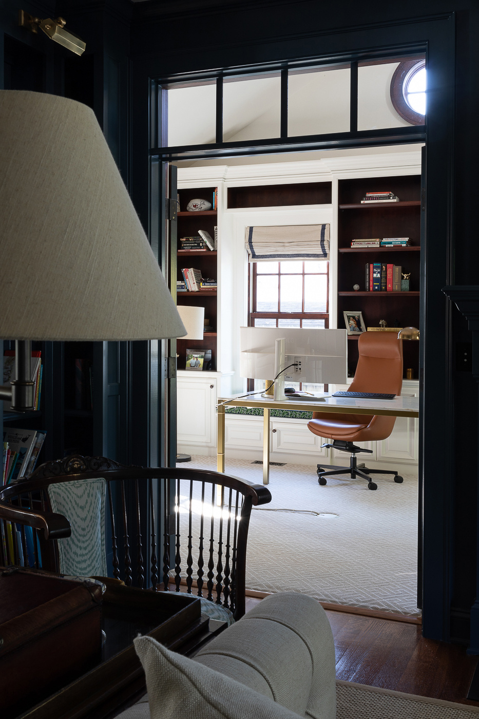
On the opposite side of the room, just beyond another pair of doors sits a home office. In here we left the original stained cabinetry for the interior of the shelves but painted out the face frames. On the walls, Michelle hired a local firm to upholster the walls in a beautifully subtle fabric.
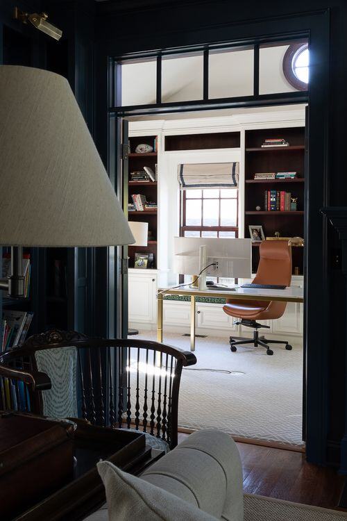
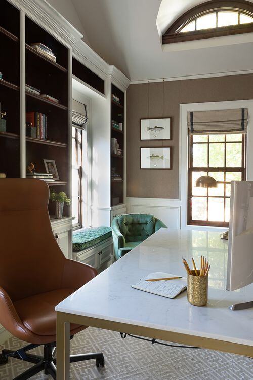
And finally, the last access point to the library leads into the home’s family room. Other than a fresh coat of paint and wallpaper on the walls not a lot needed to happen in here!
There are so many spaces to explore in this home. If you haven't already, be sure to checkout other sweet vignettes upstairs including the laundry room, landing and mudroom.
-
An Adult Escape
-
Two Literature PhDs Walk Into a Living Room…
