When a Scovell client buys a Scovell house
PROJECT OVERVIEW
It’s a small world, indeed. This particular story proves it through and through. Back in 2007 and 2008 we partnered with some past clients to build a house in Mission Hills. It was a speculative project and was scooped up by a lovely family at completion.
Fast forward several years and this lovely family became quite close with some new out of town neighbors that moved in one door down. Dinners were shared and visits to each others’ homes became a frequent occurence. Slowly but surely these out of town neighbors began to fall in love with their neighbor’s white colonial. Meanwhile, at their own home, a 1920s beauty, Scovell popped over to do a little work here and there, forming a relationship.
At some point the request was made: the 1920s homeowners asked to be first in line if ever their neighbors decided to move. Luckily for them, soon enough, they did just that.
And that’s how a Scovell client bought a Scovell house from another Scovell client and asked Scovell to remodel it again!
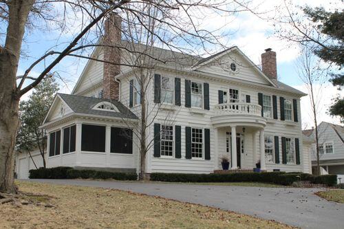
THE SOLUTION
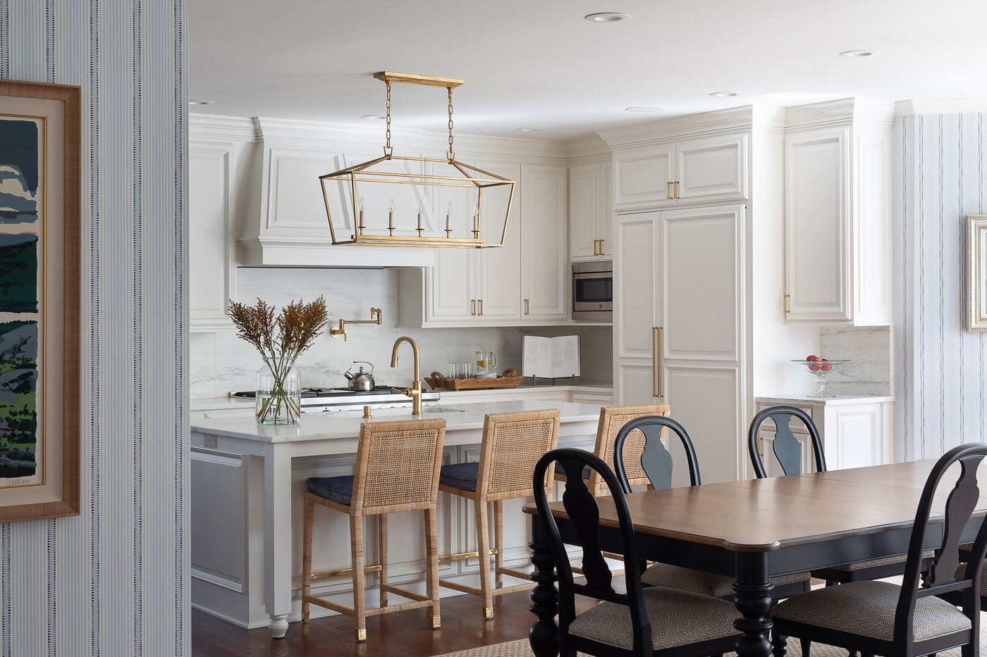
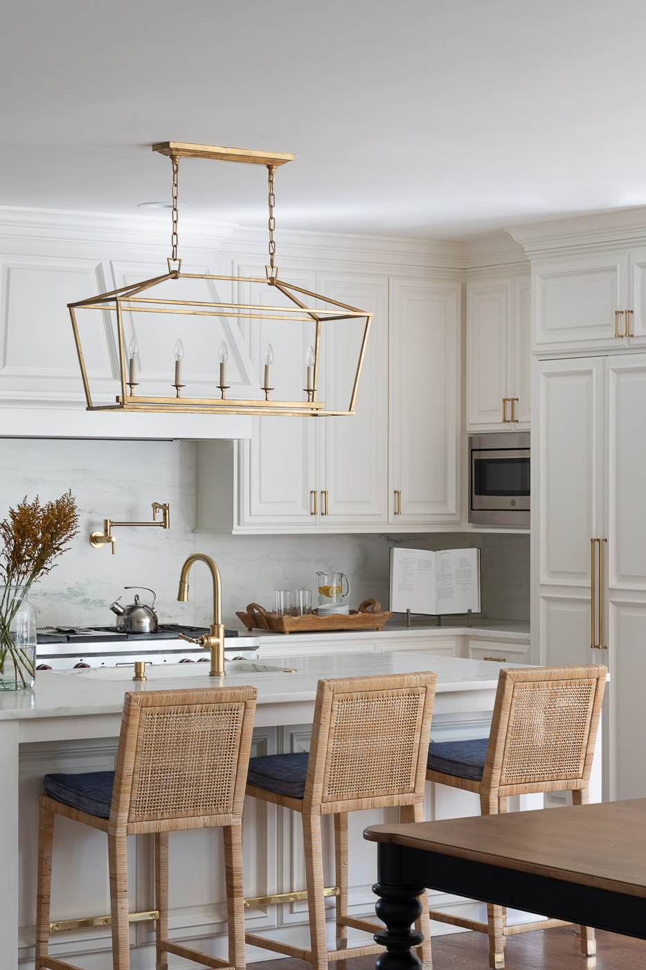
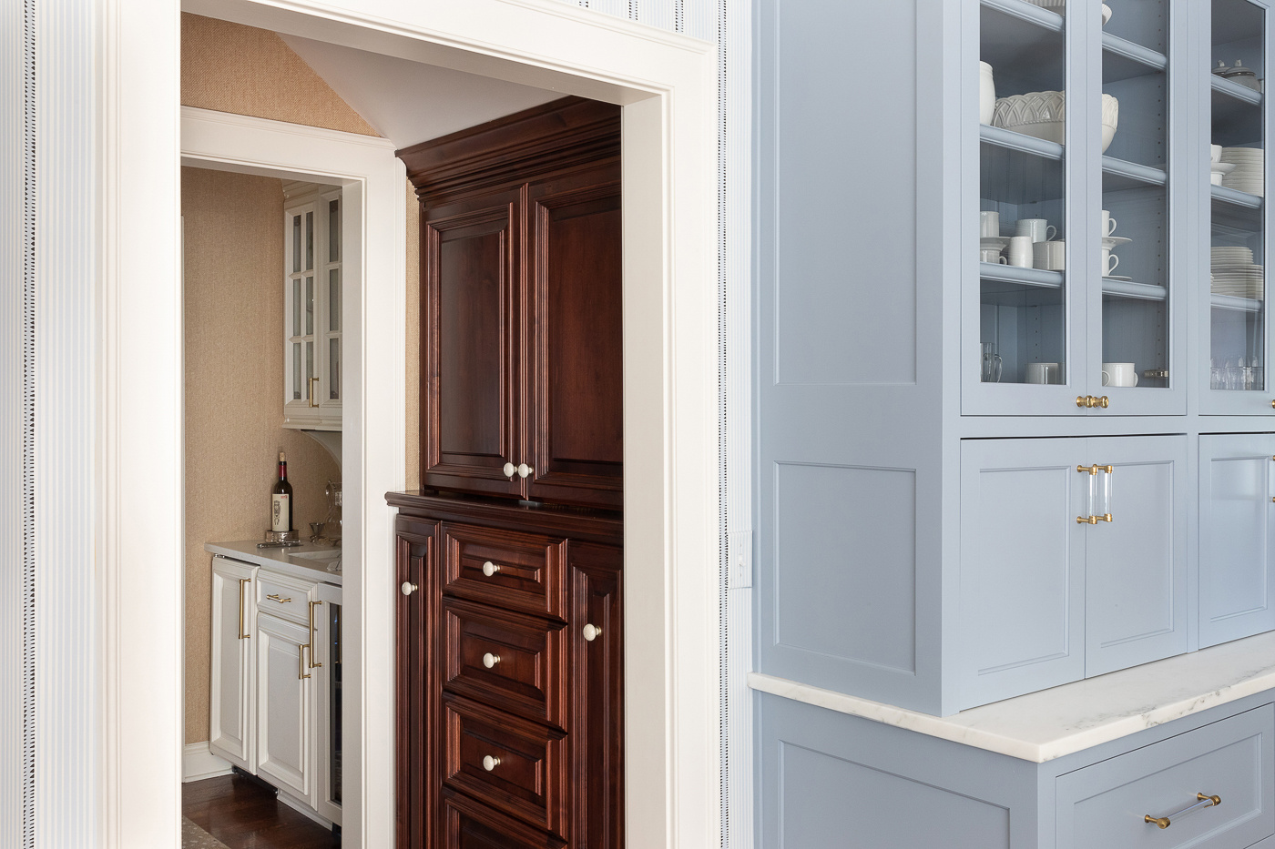
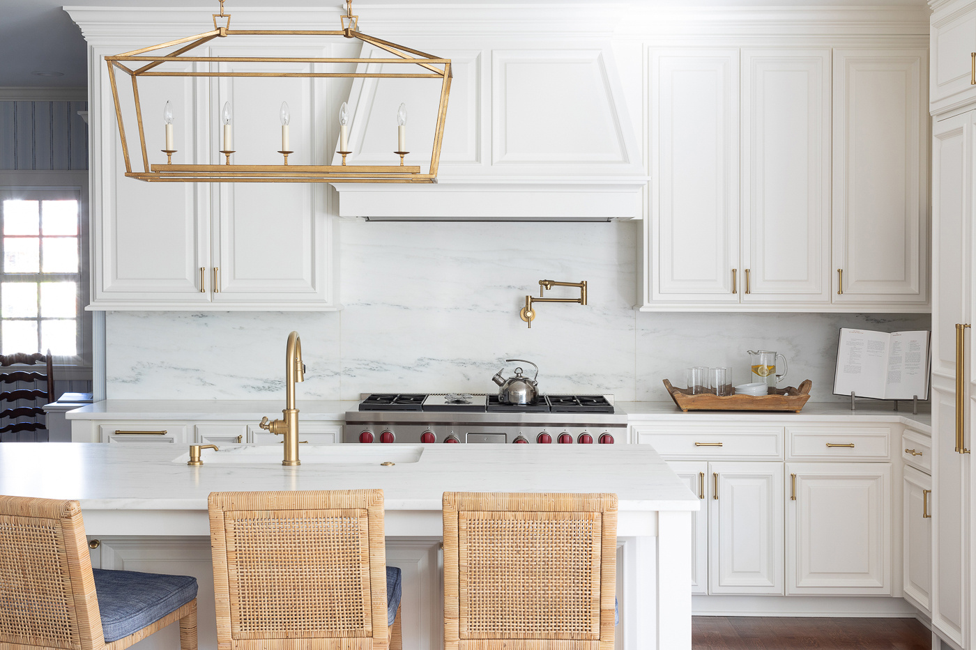
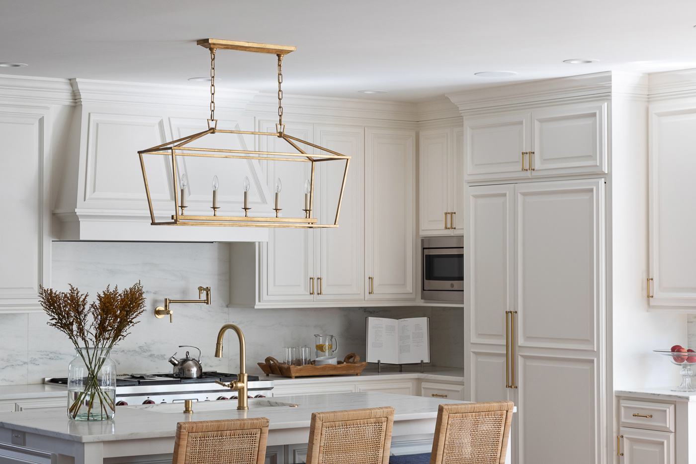
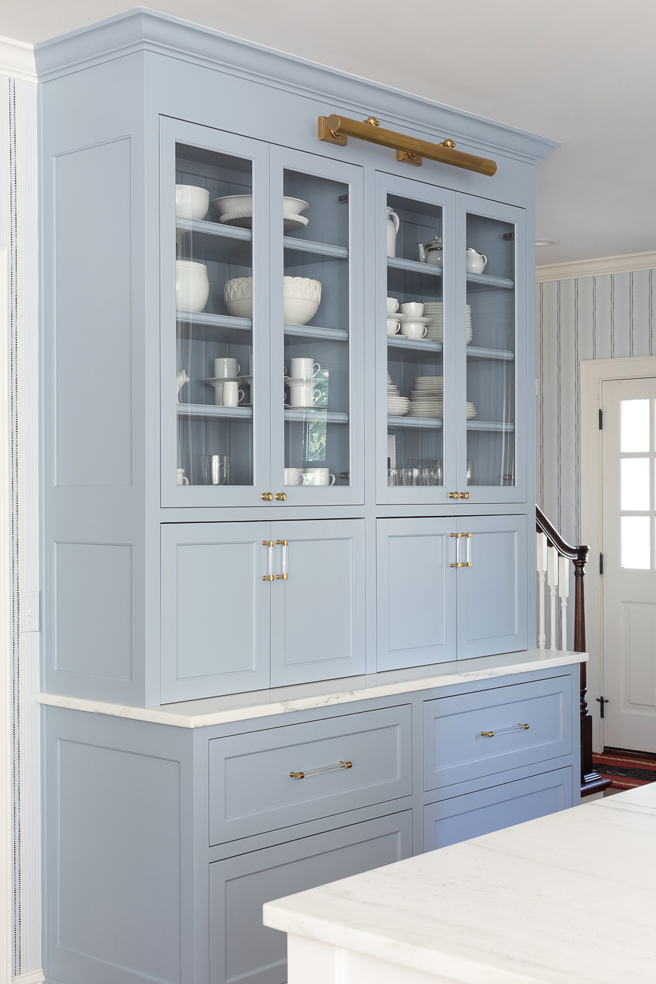
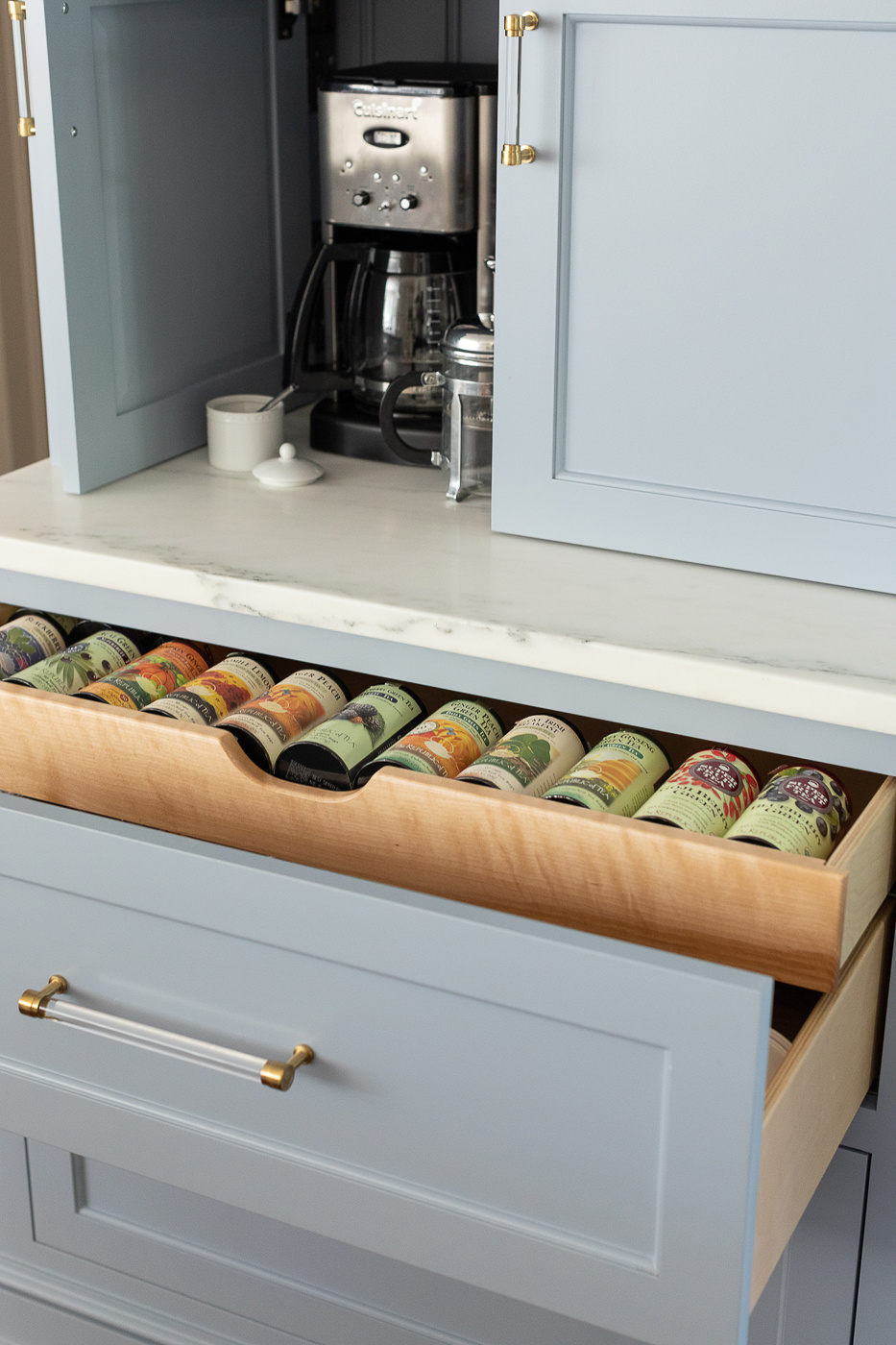
Remodel is actually too strong of a word. More like a refresh. These new homeowners – the wife, an interior designer – wanted to add her stamp to the house, starting in the kitchen. The cabinetry was great and well-built, but as you can see in the picture above it was a little dark. A remodel wasn’t exactly needed, but some sprucing for sure.
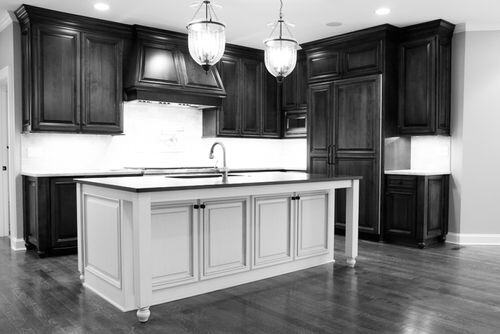
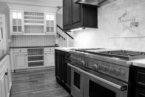
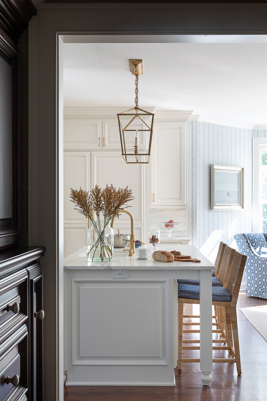
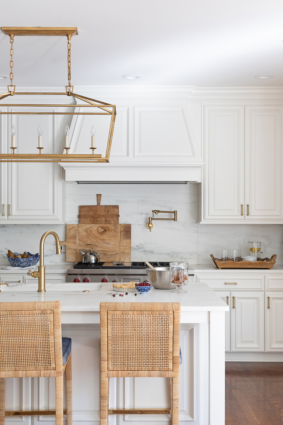
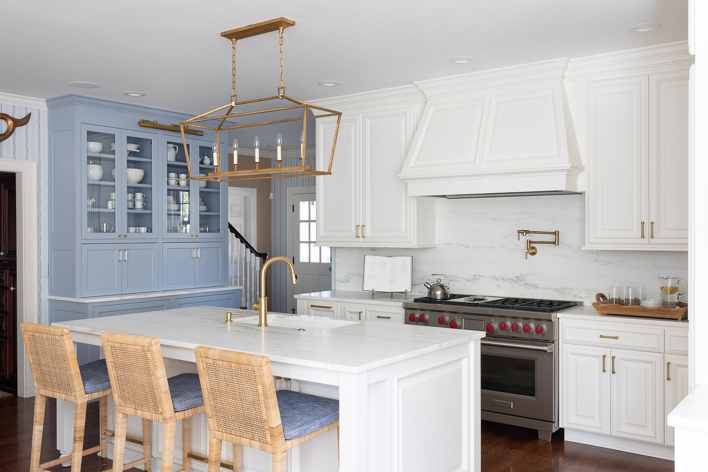
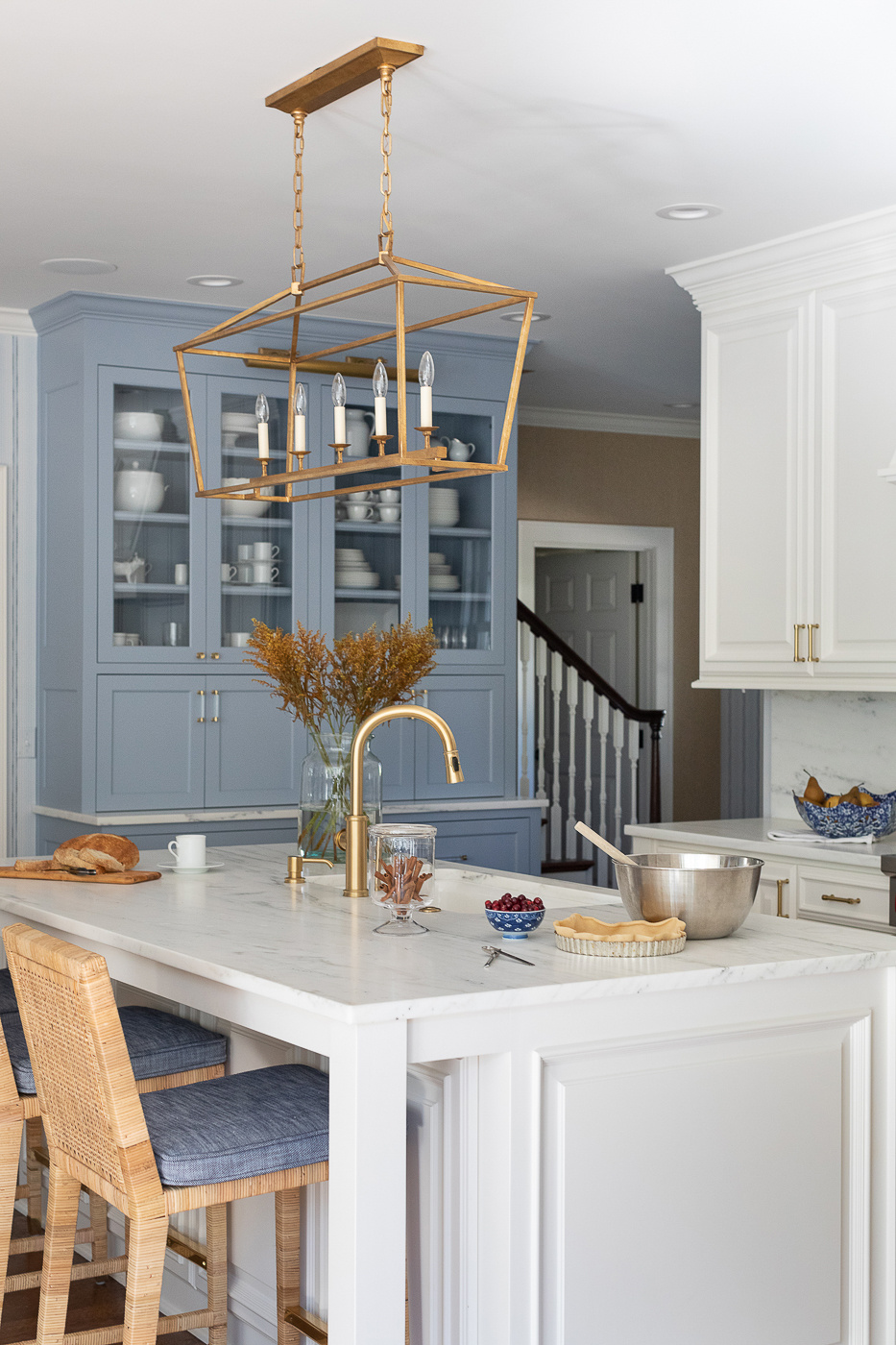
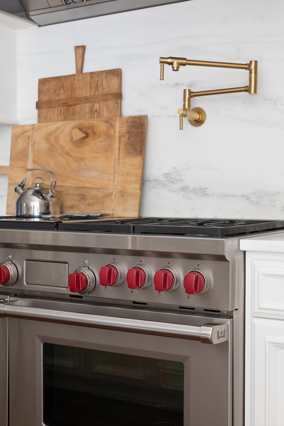
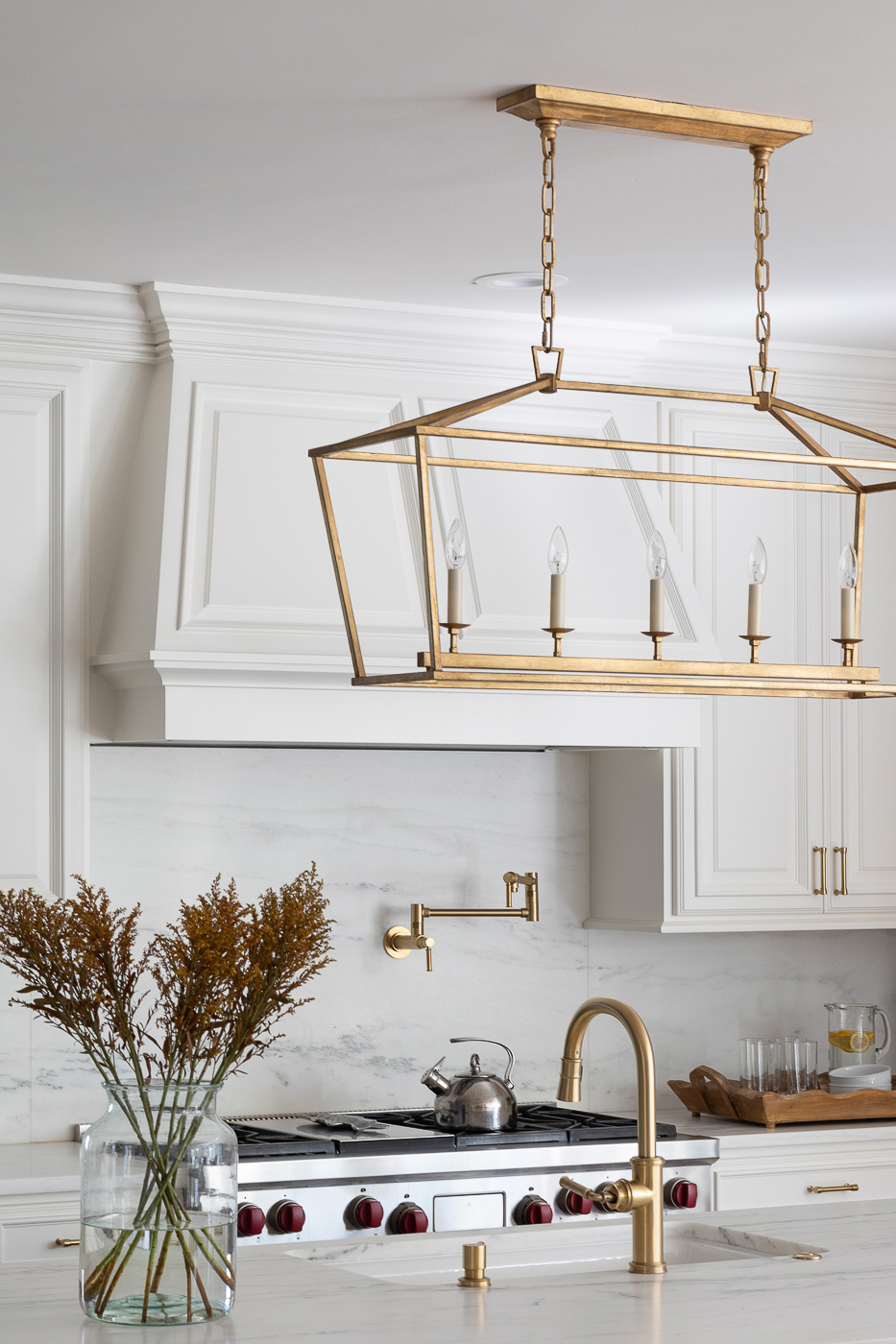
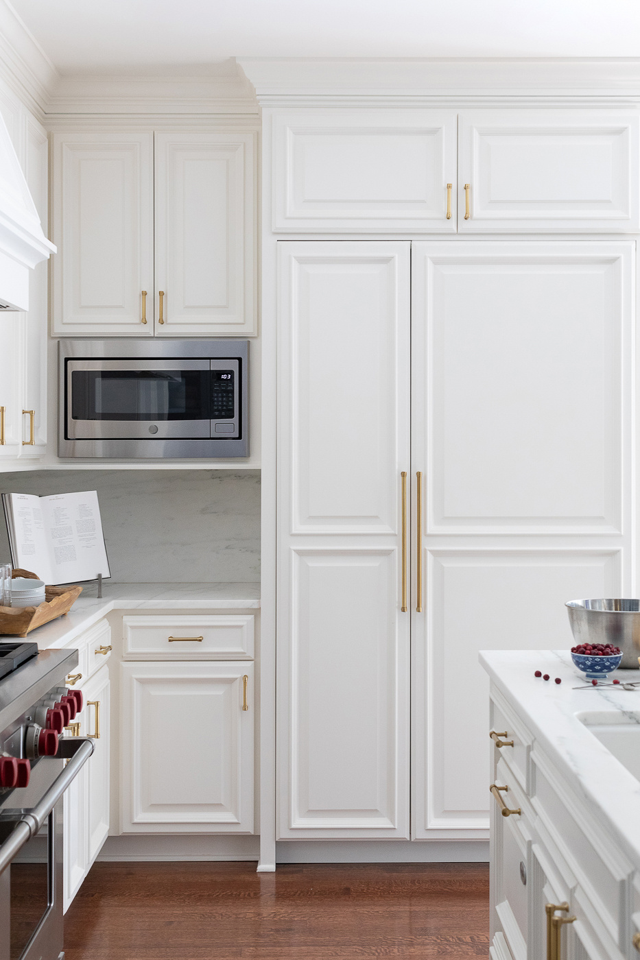
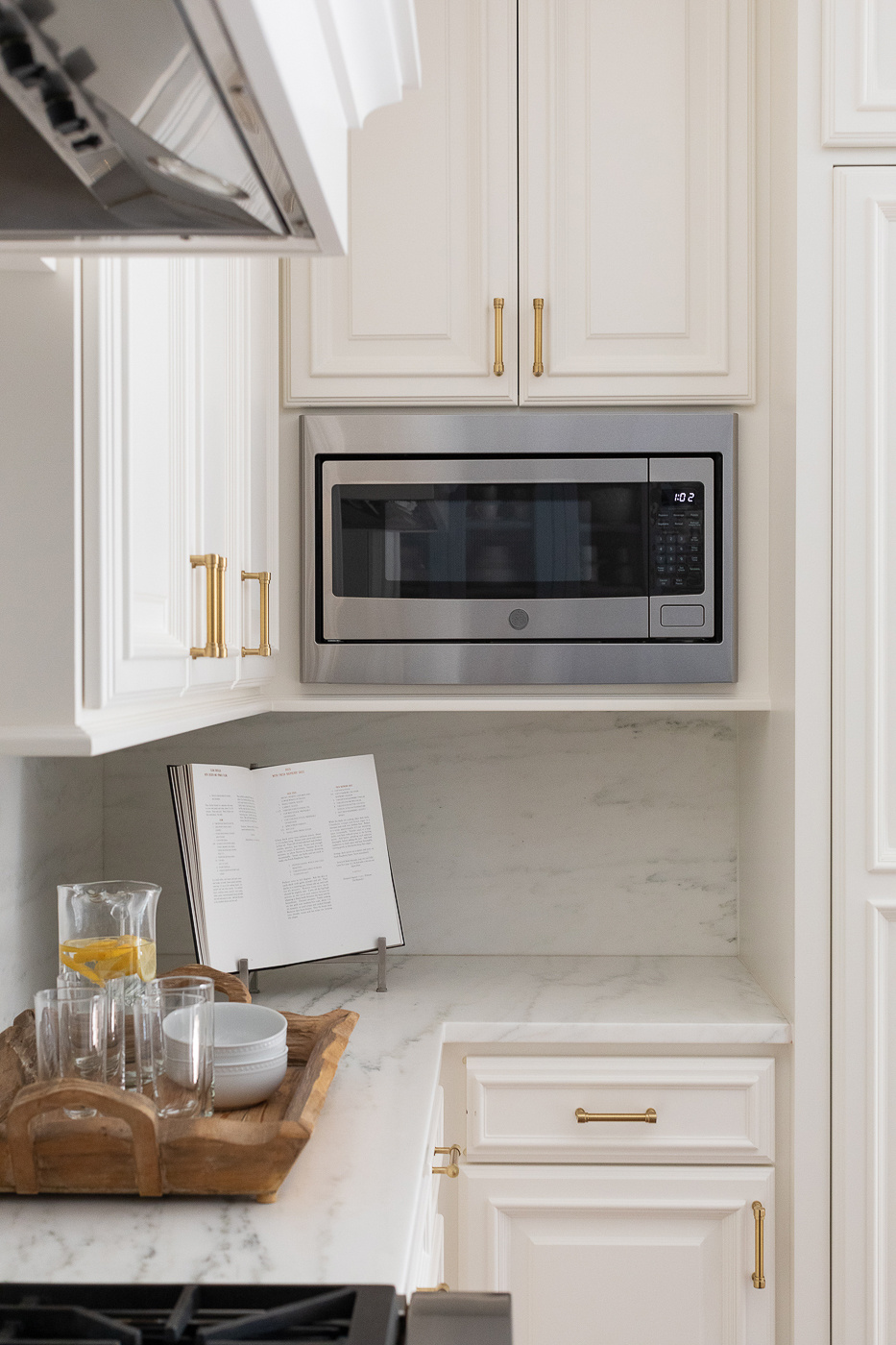
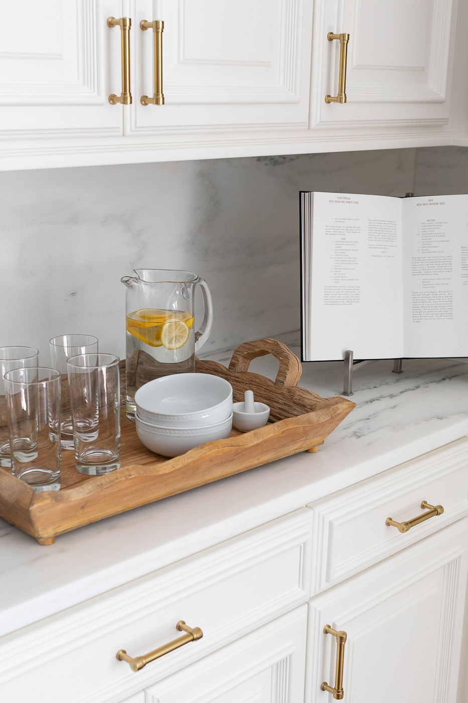
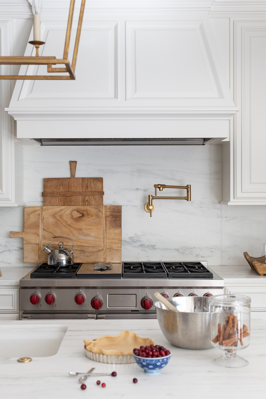
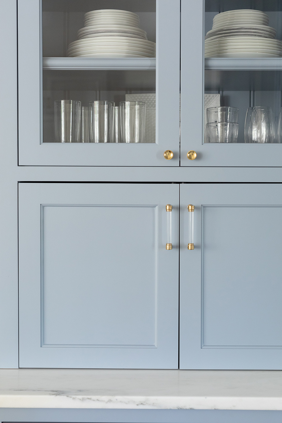
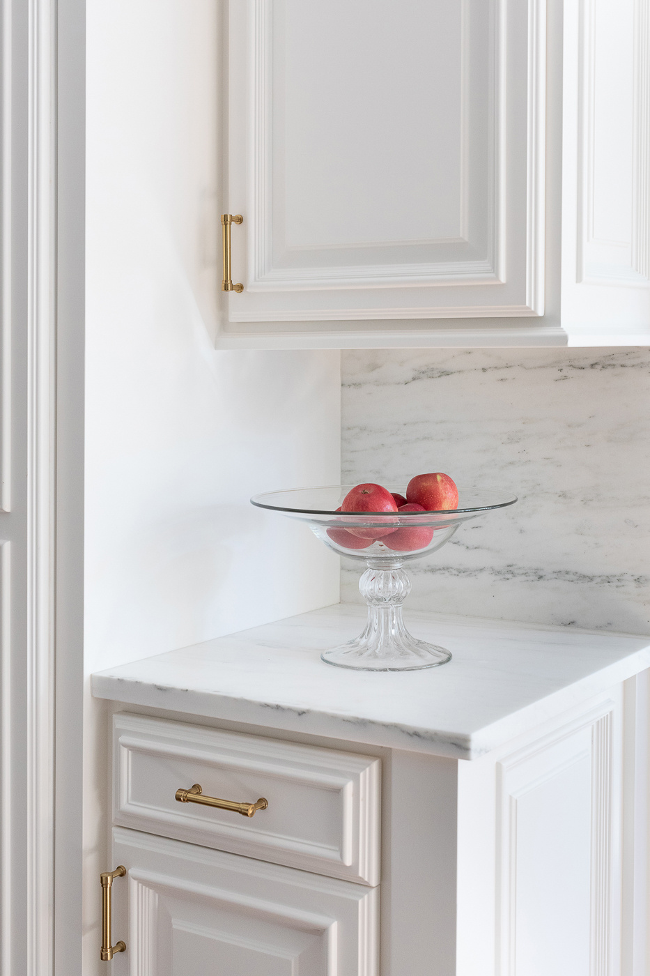
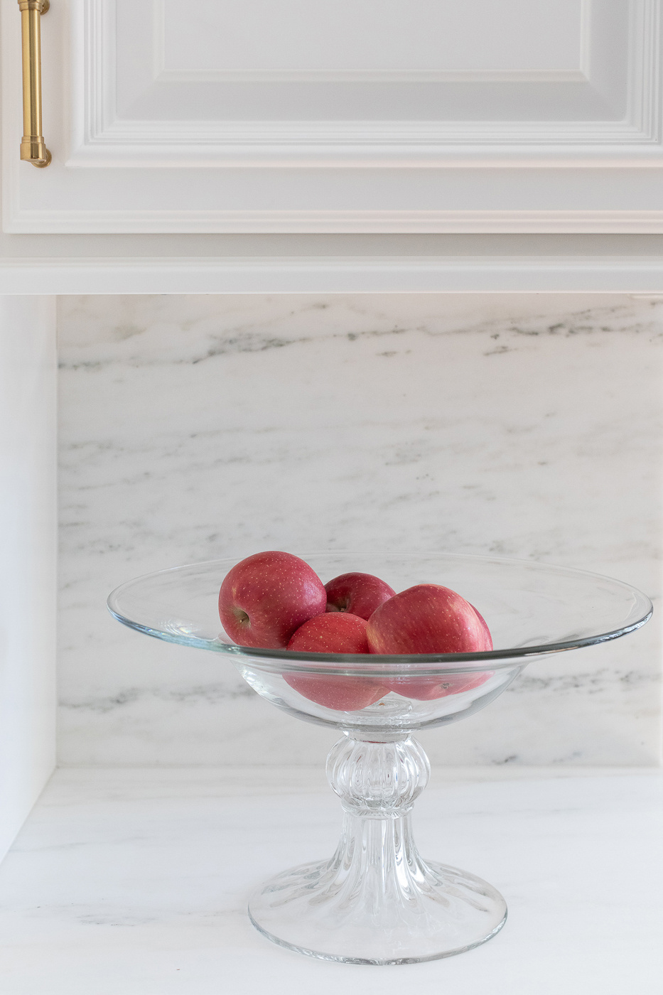
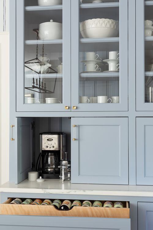
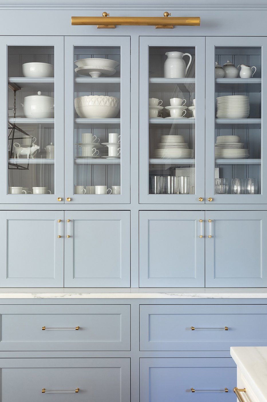
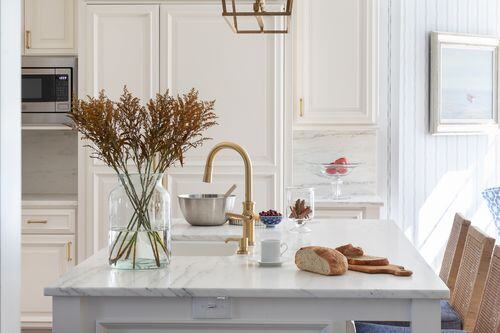
Nothing a little paint couldn’t fix. Well, paint and a new slab backsplash and top from Carthage marble. Plus some hardware, updated plumbing fixtures and a new light!
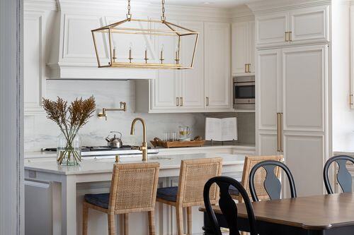
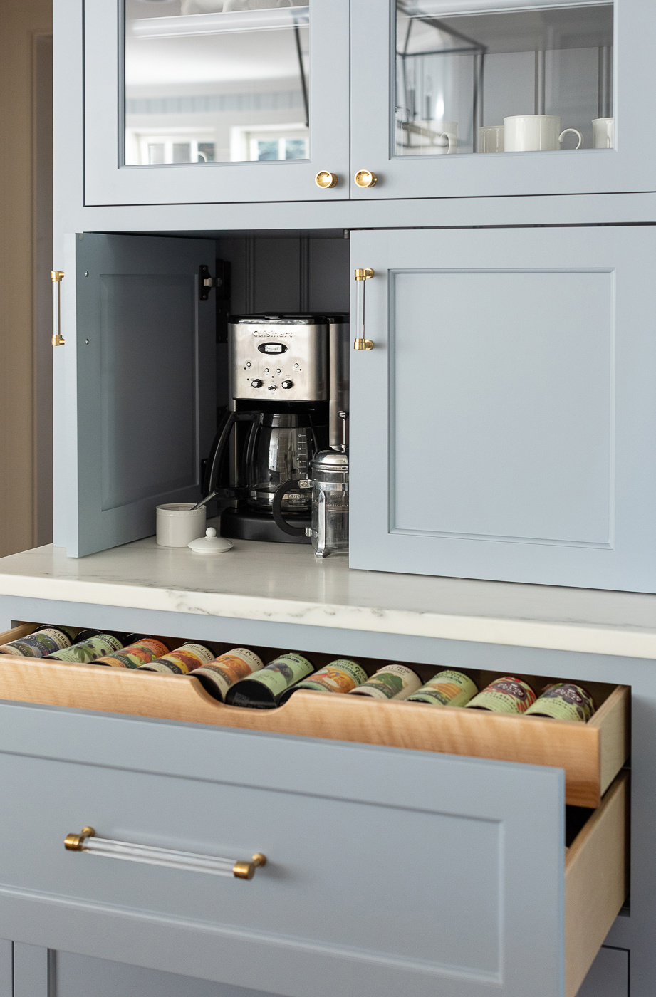
That’s the thing about investing in a well built kitchen the first time around. The bones are good enough to keep and you can get away with a cosmetic makeover.
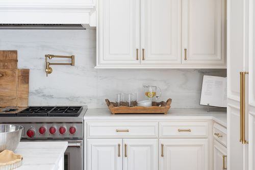
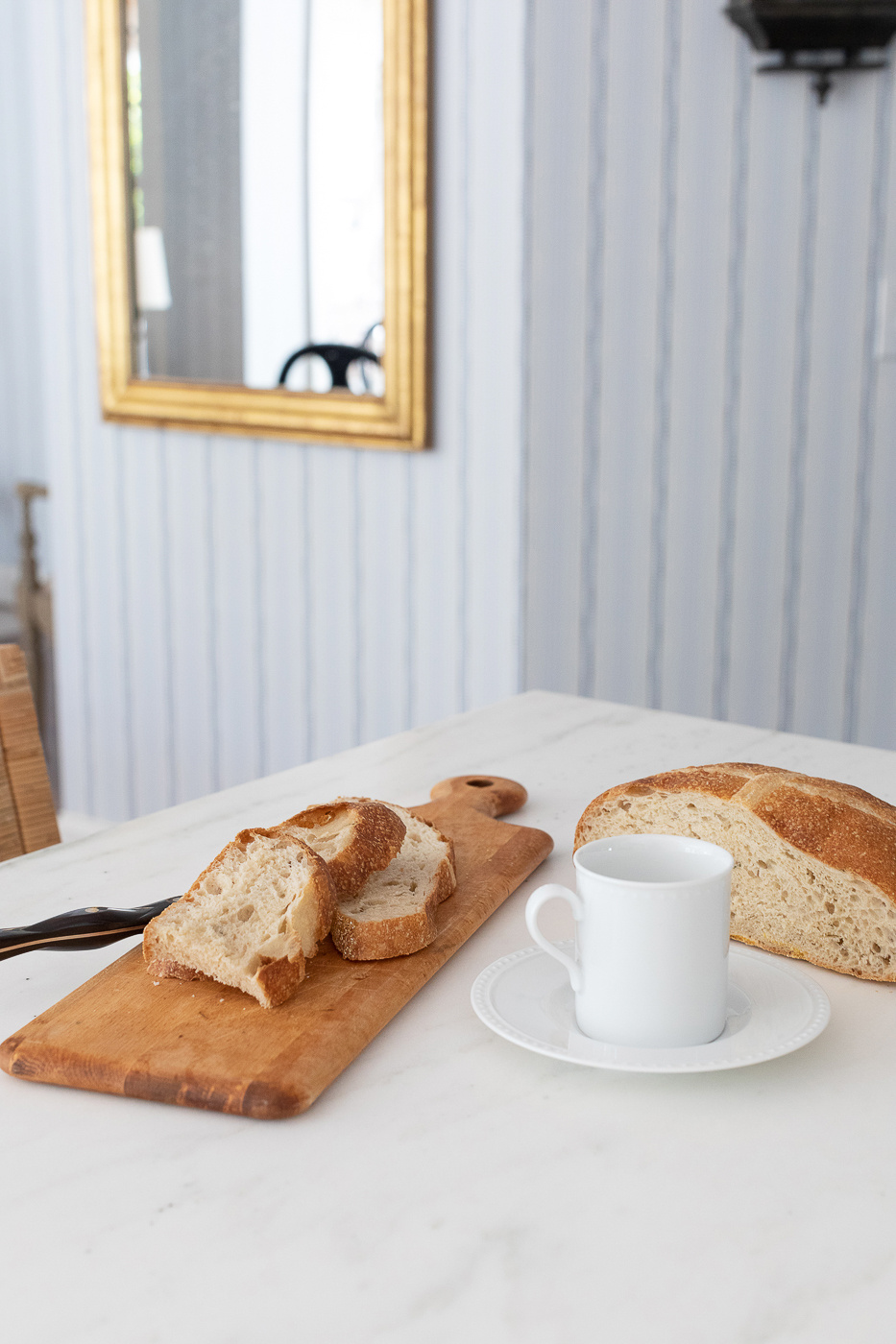
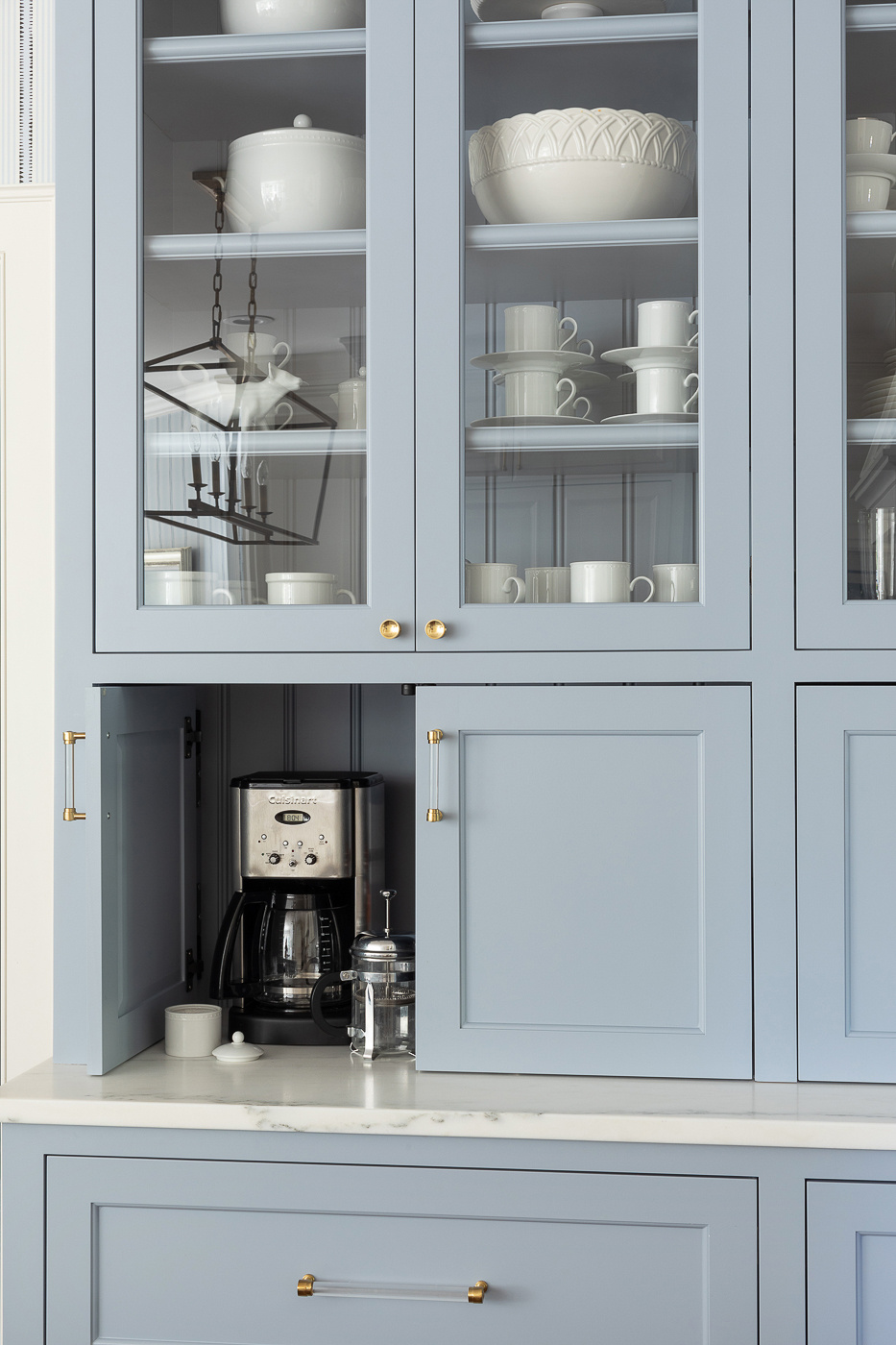
The result? Fun and bright but still simple and elegant. And it helps to have good friends. It’s particularly helpful if your good friend owns JSH and offers to come over and style your cabinets for you. Jenny knocked it out!
Interior Design by Michelle Oettmeier
Photography by Laura Kackley
-
Make it functional. And pretty, too.
-
A Proper Kitchen for a Proper Family
-
A Hague Blue Bar for the Win
-
A Family-Sized Kitchen
