Make it functional. And pretty, too.
PROJECT OVERVIEW
We all have our thing. For some it’s buying high quality food from Whole Foods and farmer’s markets. For others it’s art + rugs (it me!). And for others, it’s their wardrobe. I know rather confidently that this client qualifies for the last category: wardrobe. Over the years she has accumulated an incredible ensemble of beautiful pieces of clothing, shoes and purses. Think: Sarah Jessica Parker. And like Sarah Jessica Parker in the first Sex and the City movie, this client needed a closet fit for her collection. A little reach-in closet in the bedroom wasn’t cutting it.
Luckily for her, there was an unfinished attic over the garage just beyond their bedroom. Of course, her wheels were already turning when I arrived to the first appointment. She had a vision for finishing that attic space – it was just our job to figure out exactly how to lay it out and execute.
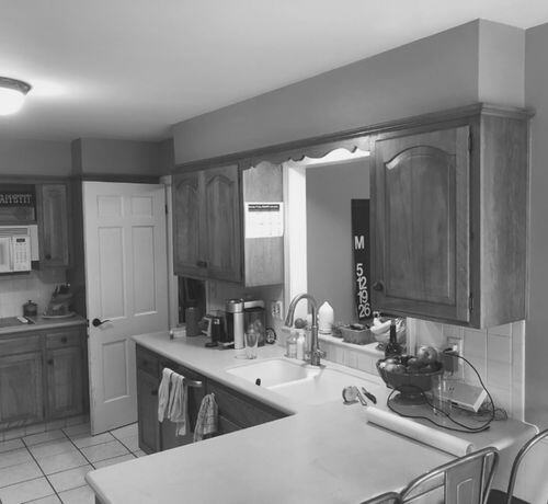
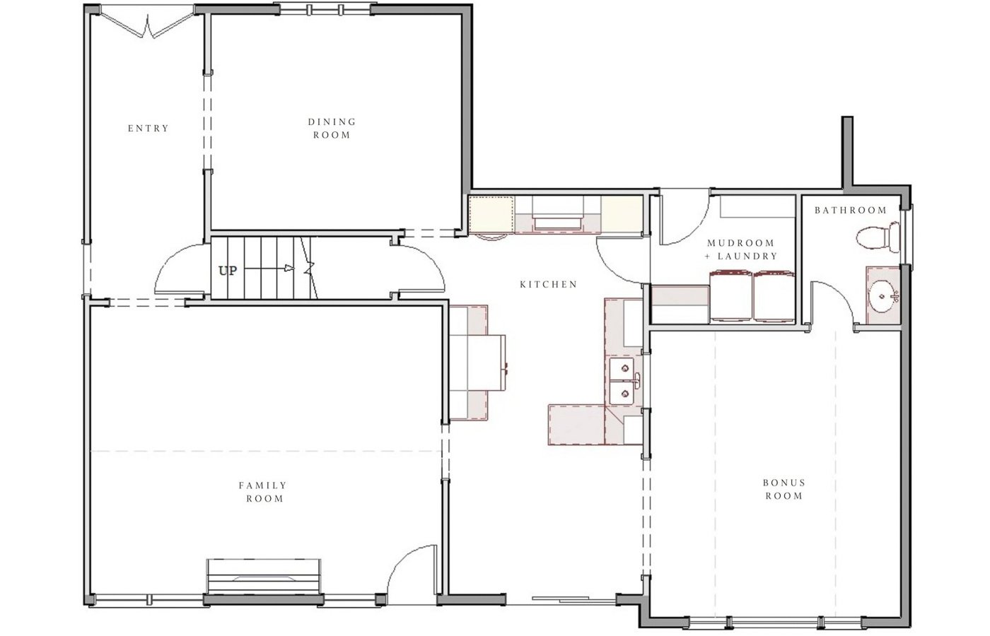
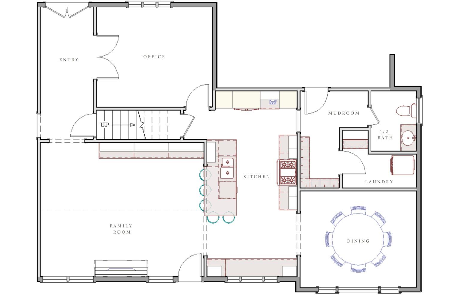
The original kitchen was straight out of the 80s. Dated. Not a lot of counter space. Soffits that ate up what could have been used for additional upper cabinets. Bad lighting. A microwave the family hated. No visibility to the family room. The list goes on. You can see some of the problems in the original floorplan shown below.
THE SOLUTION
A big goal was 5 barstools. That and make it pretty. Make it functional. Funny enough they didn’t really request much in terms of an improved mudroom and laundry room. I think they just thought they were stuck with what they had. But you can see in the floor plan we proposed below we were able to totally rethink how the space was allocated.
A few key moves included opening a wall to the family room and relocating a door to the existing powder bathroom.
DESIGN CONCEPT
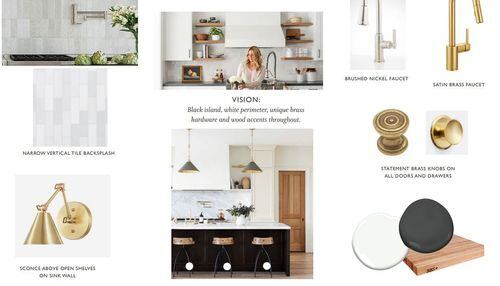
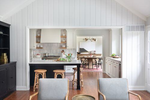
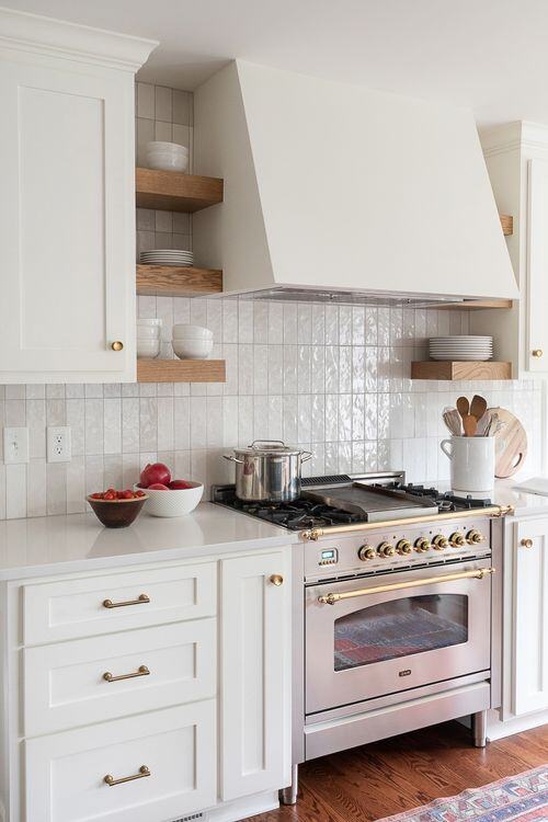
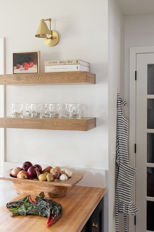
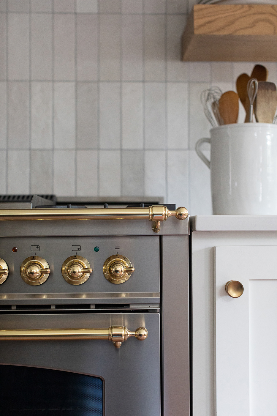
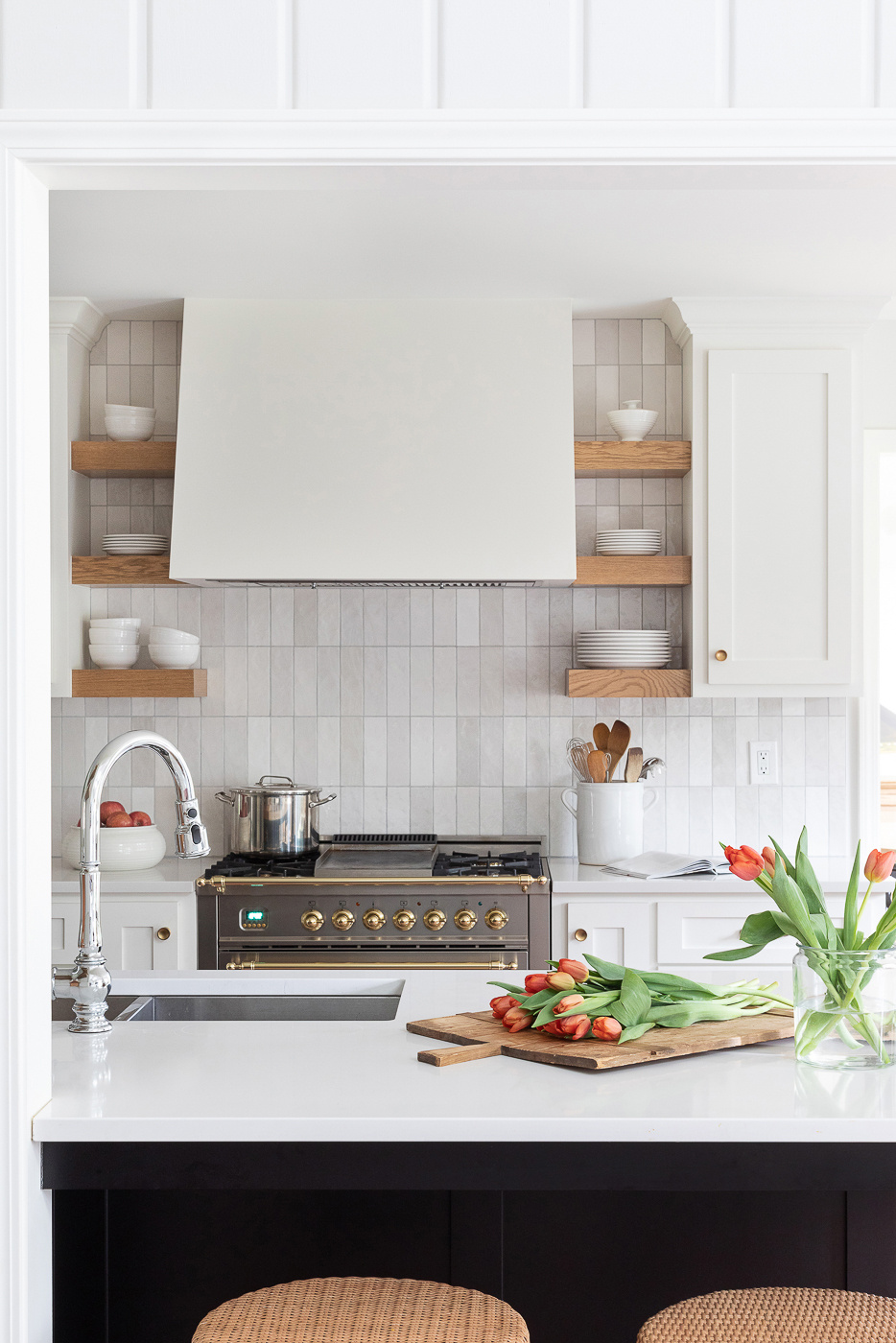
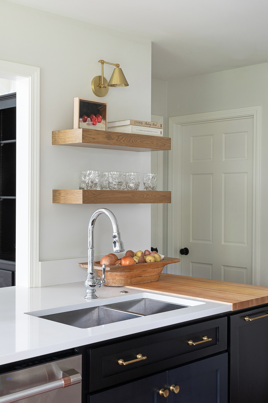
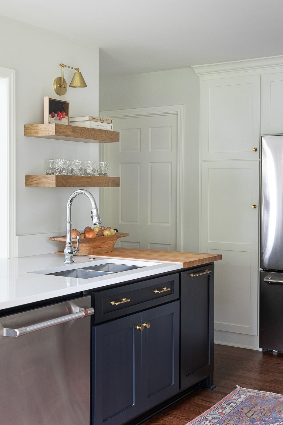
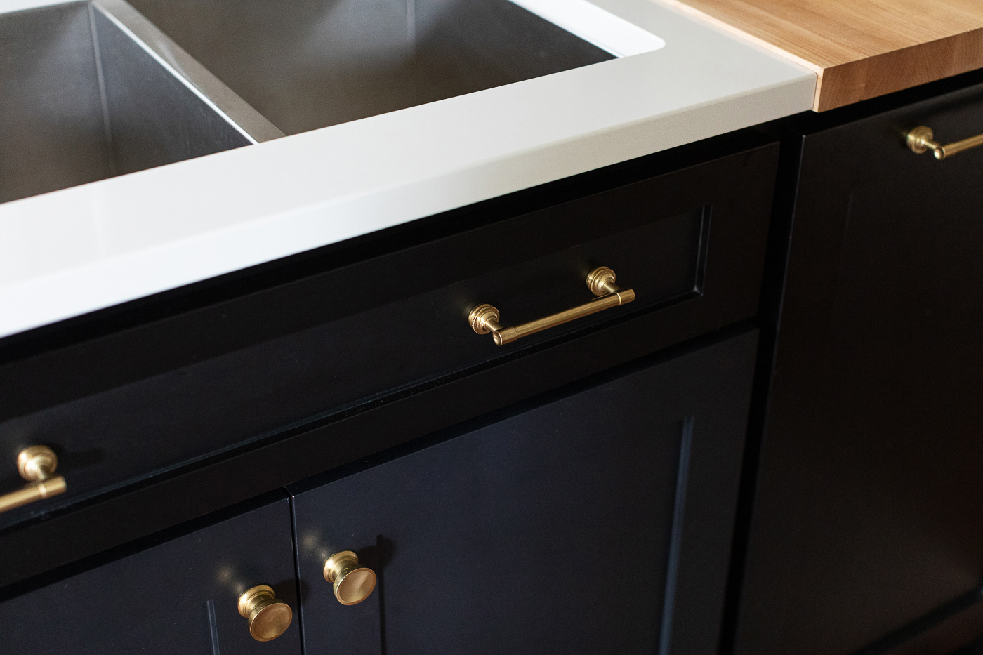
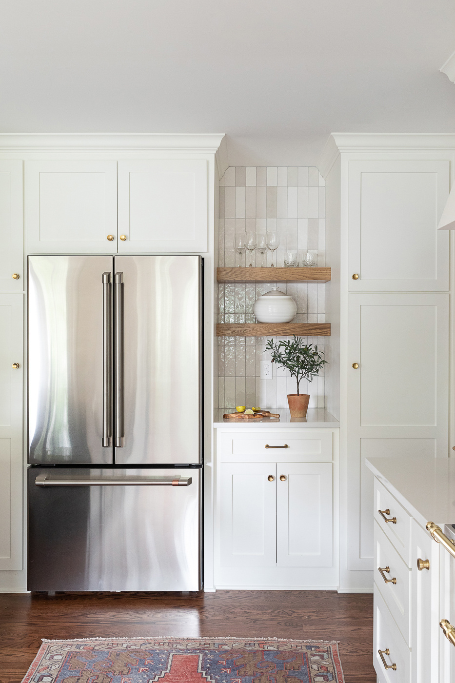
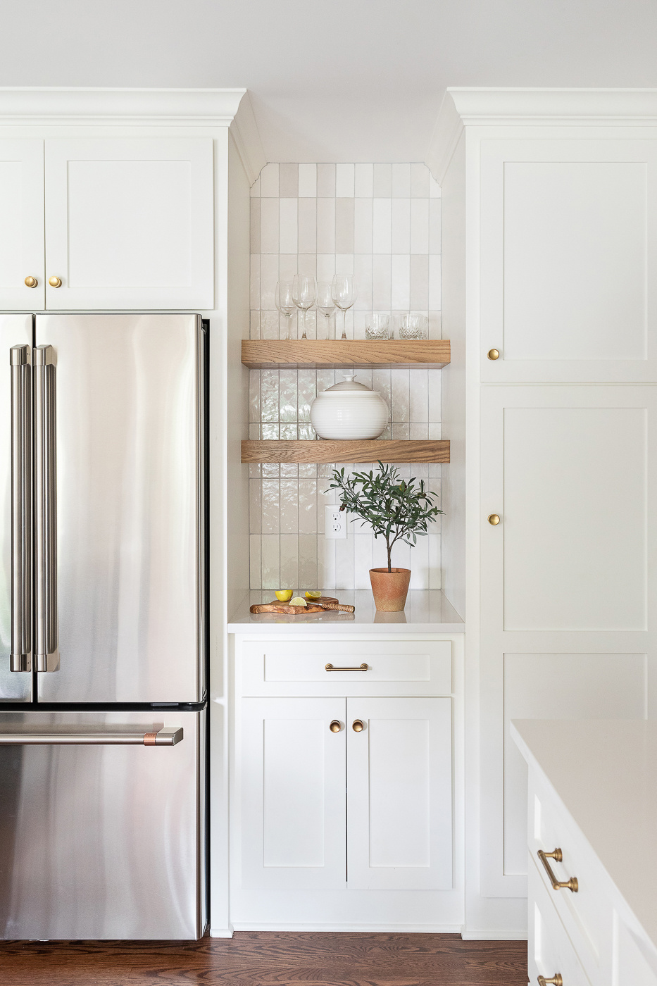
With the main elements in place we could move on to playing with the aesthetics. We narrowed down on a vision of a black island, with a white perimeter, unique brass hardware and wood accents throughout.
We threw it into a rendering once we had design vision. The black paint was a nice tie in to the existing black bookcases in the adjoining living room. Brass knobs made for a good contrast. And the integrated Boos block was a fun request from the client.
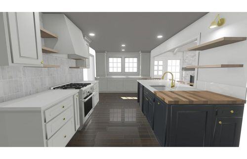
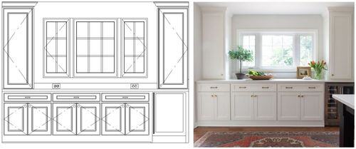
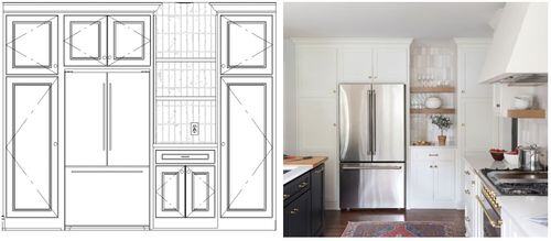
Here are some elevations to give you a better sense of how the space laid out in the kitchen.
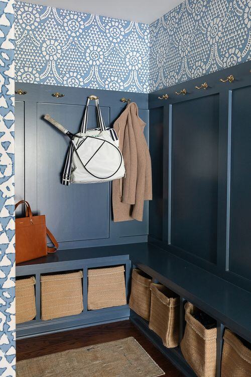
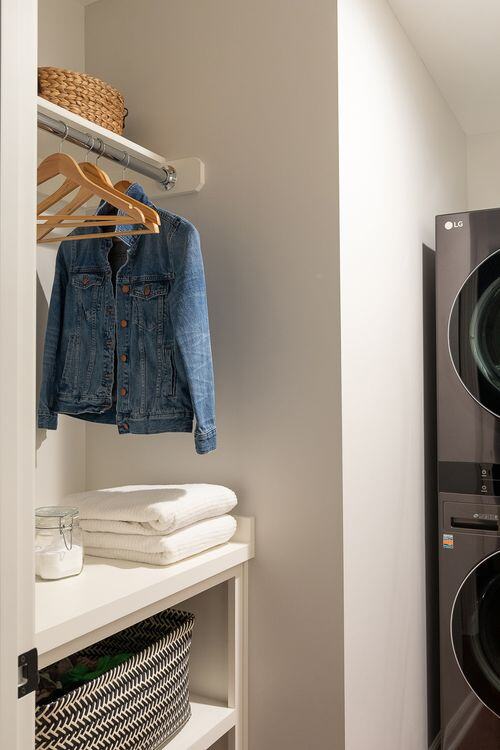
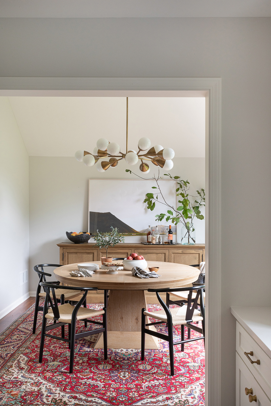
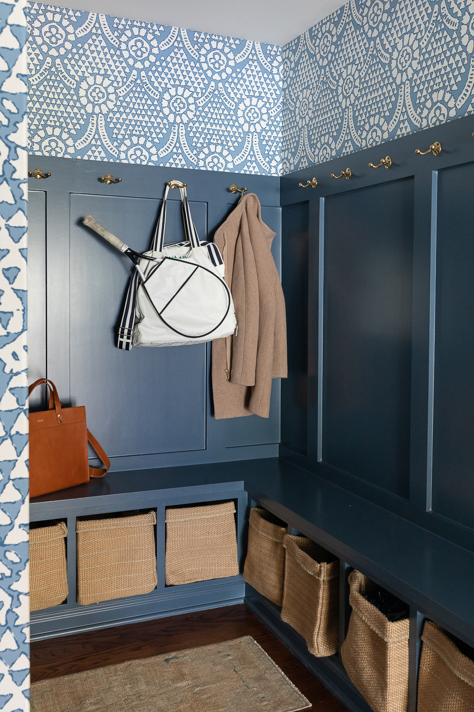
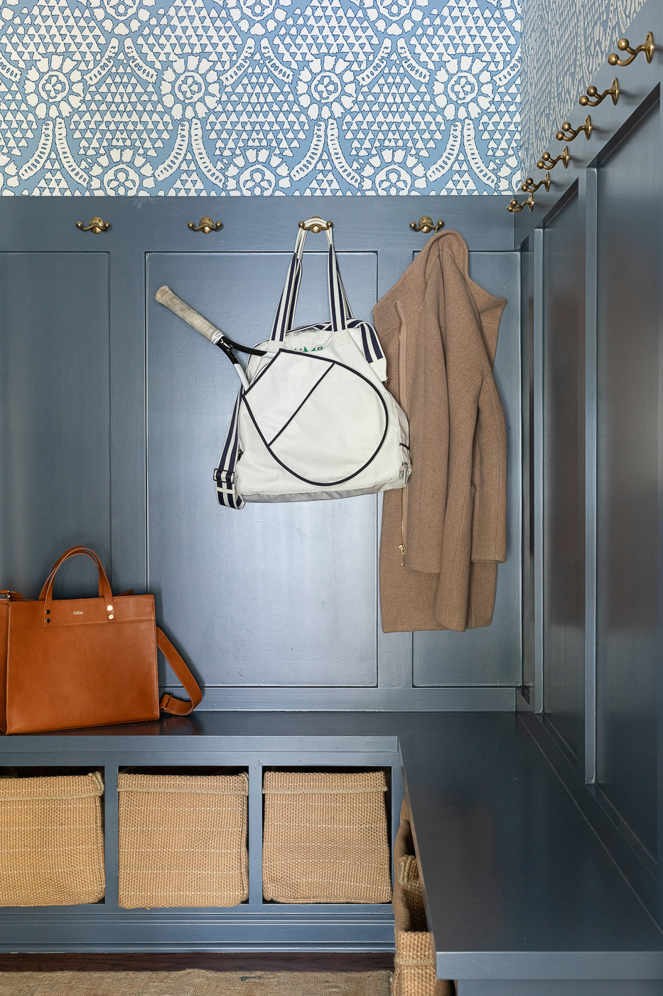
Around the corner, the new mudroom eased the access area into the home with a dedicated space to catch the clutter, and a separate enclosed laundry room. We did this by shrinking the” bonus room” into an appropriately sized dining room. Then we made the old dining room an official office by installing some french doors in place of a cased opening.
Everytime I cross paths with this family I always ask the same question: doesn’t your family function so much better in this new layout?! And they eagerly agree. Because with 5 kids – you ain’t got time for a wasteful floorplan.
-
When a Scovell client buys a Scovell House
-
A Proper Kitchen for a Proper Family
-
A Hague Blue Bar for the Win
-
A Family-Sized Kitchen


.jpg)
.jpg)

.jpg)

.jpg)