A Hague Blue Bar for the Win
PROJECT OVERVIEW
Ruth and I were both pumped about this project the minute we learned that our client taught etiquette classes. We knew we’d get the chance to develop a thoughtful plan that was perfectly designed for hosting wonderfully organized and well-appointed parties. And that’s just what happened.
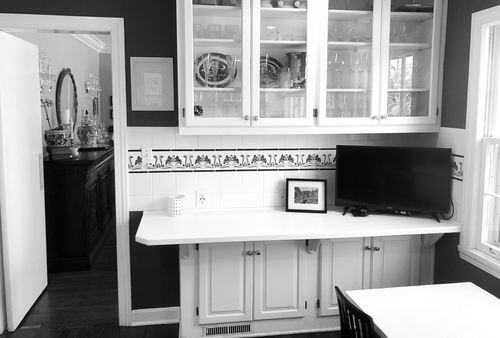
THE SOLUTION
We’ll talk more about the entire floorplan overhaul and addition in another blog post. But for now let’s just zoom in on this bar. Not just a bar though. It’s the connection point between their new kitchen, their grand dining room and their well-outfitted backyard.
Prior to the remodel and addition, the family had but the dining room for all their meals – breakfast, lunch, and dinner – with their three young boys. No breakfast room. No kitchen island. So this wasn’t a grand dining room that only sprang to life on Thanksgiving and Christmas. No, this was an every night of the week workhouse kind of grand dining room. So it needed to be proximite to the kitchen and have great flow between the spaces.
DESIGN CONCEPT
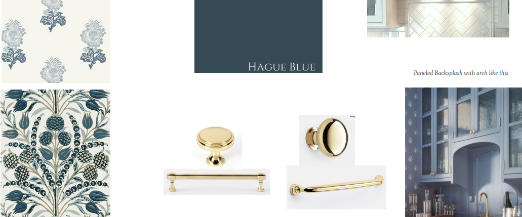
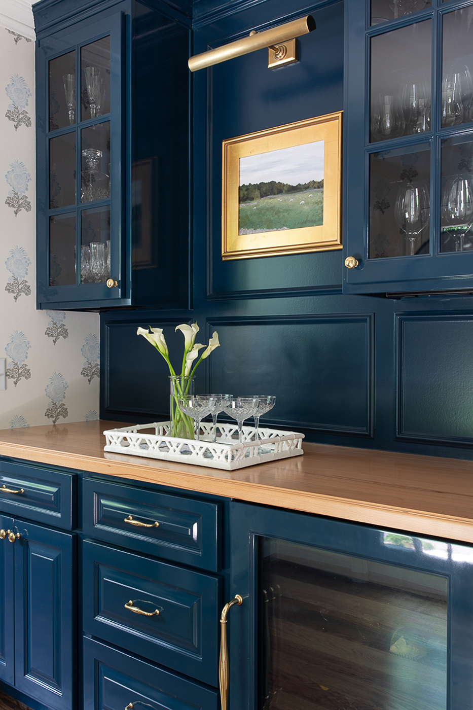
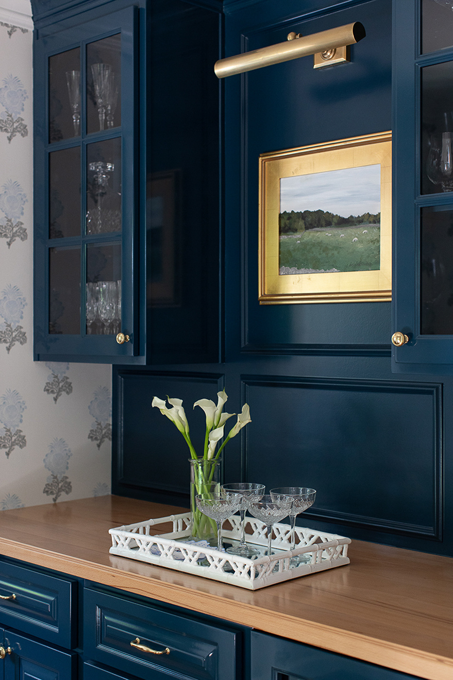
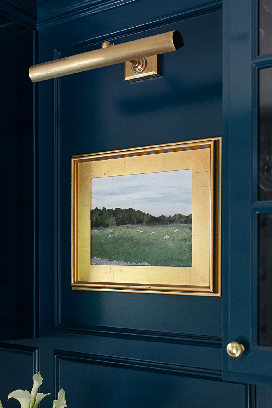
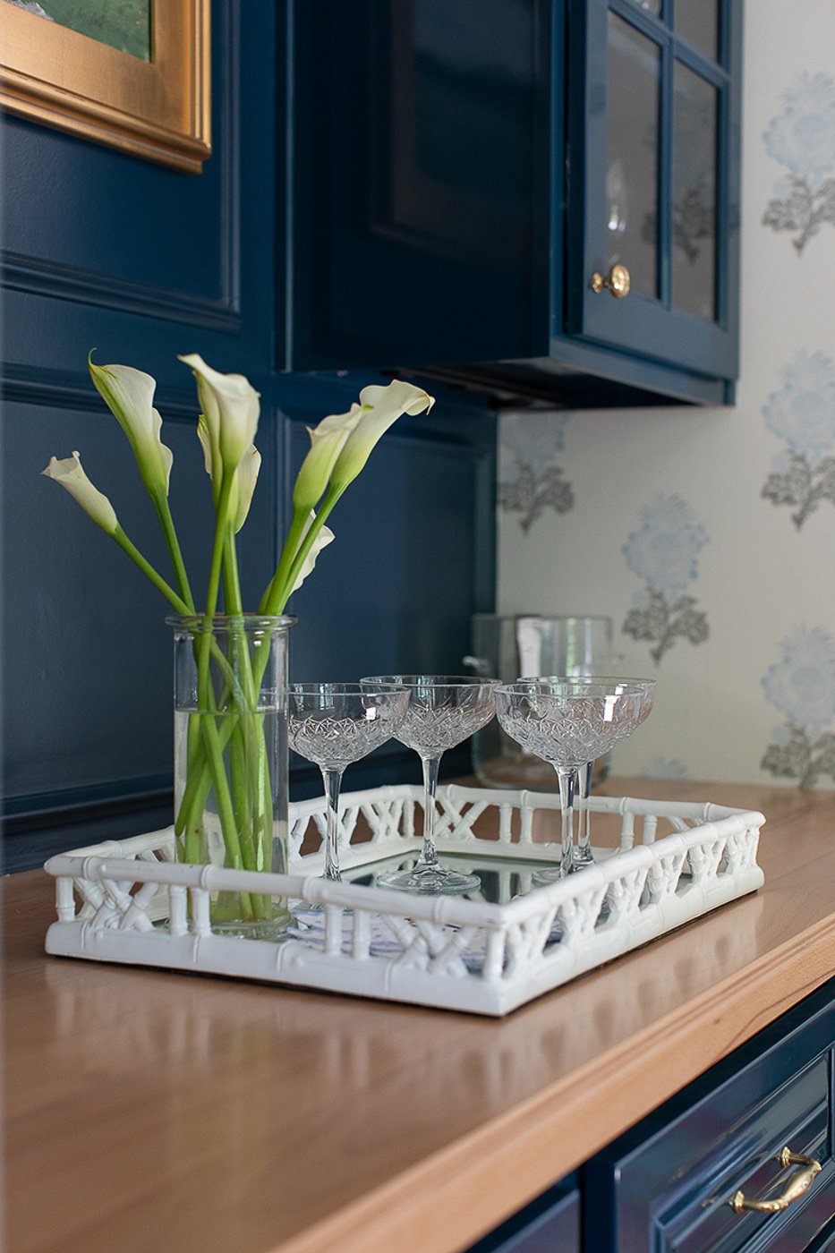
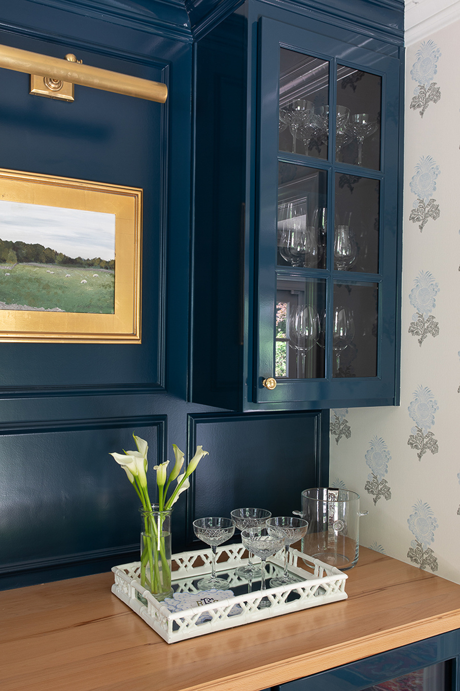
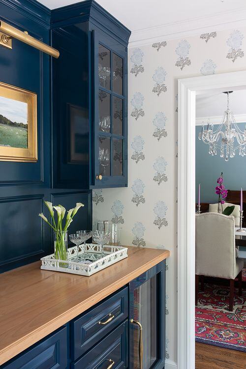
No shocker here but the client’s favorite color is navy. So insert high gloss Farrow and Ball navy cabinets with Rejuvenation brass pulls off Ruth’s moodboard.
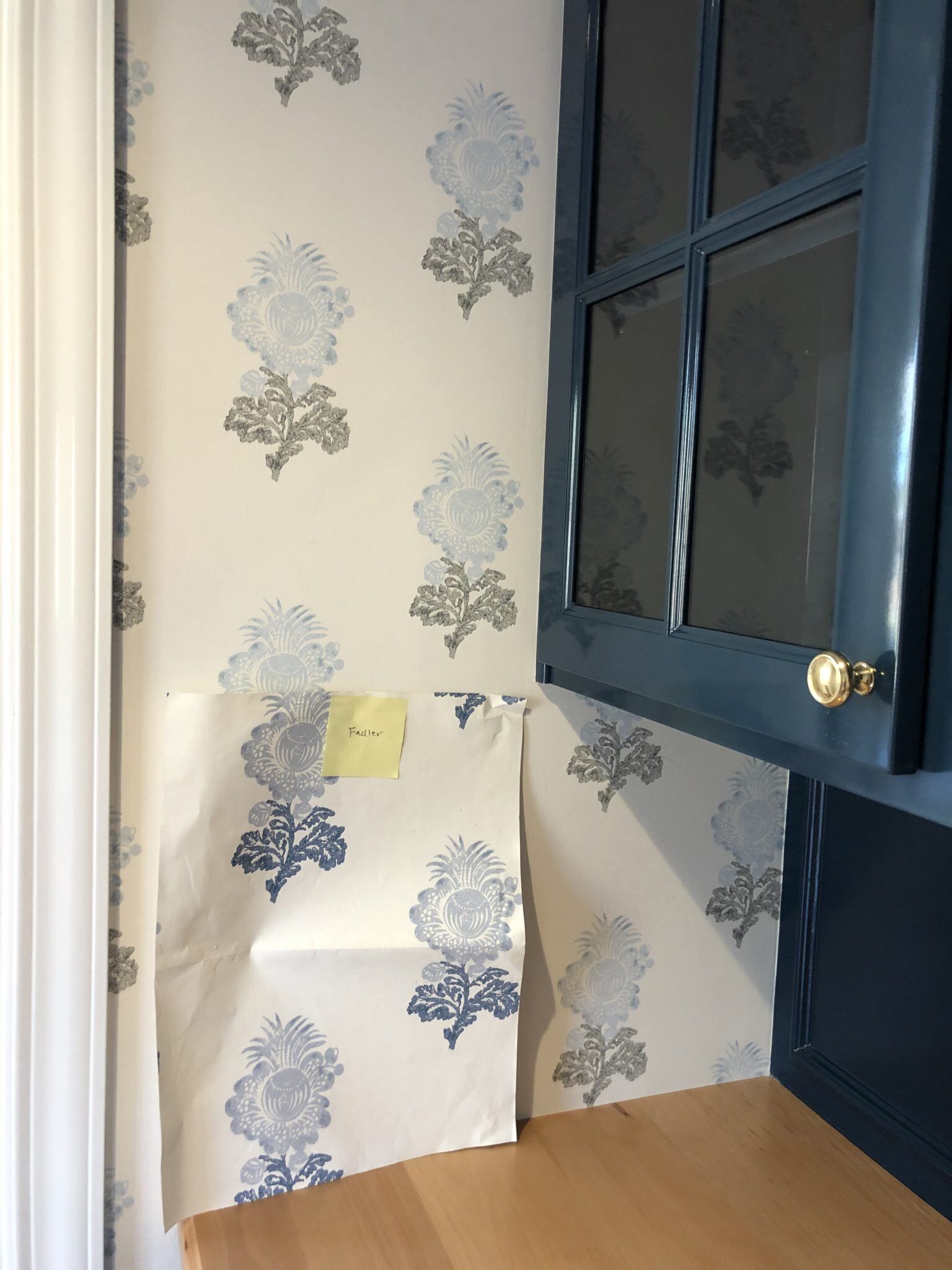

I’m going to let you in on a little secret: this wasn’t supposed to be the wallpaper that went up. However, I like to think it’s a true example of “all’s well that ends well!” And a true example of an open-minded client (aka my favorite kind of client!).
You see, Ruth and the homeowner selected the most perfect colorway of this Thibaut wallpaper and selected the cabinet paint color accordingly. However there was a little mix up at the warehouse that day because Thibaut shipped us the wrong color. Only problem is I as the one who opened the box and it looked so dang pretty that I didn’t realize it was the wrong color. So I handed it to the installer and up it went!
My phone dinged a few hours later and I thought the client would be gushing over seeing the new paper installed. Instead, she was very kindly informing me that it didn’t match the sample at all! Womp. Womp. Calls were made. The correct paper was confirmed in stock at Thibaut’s warehouse. The installer was penciled in to swap it out later that month.
But enter the husband. He honestly liked this color better. So we hit pause and decided to sit on it for a minute. And while it wasn’t the original intent, everyone agreed it really did look fantastic. While it wouldn’t have been difficult to swap it out a few weeks later, the clients made the call to just love it! And love it we all do. All is indeed well that ends well, right??
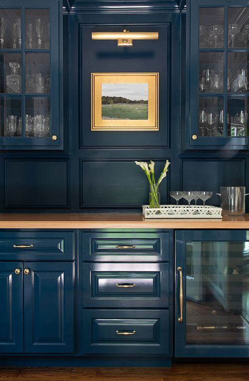
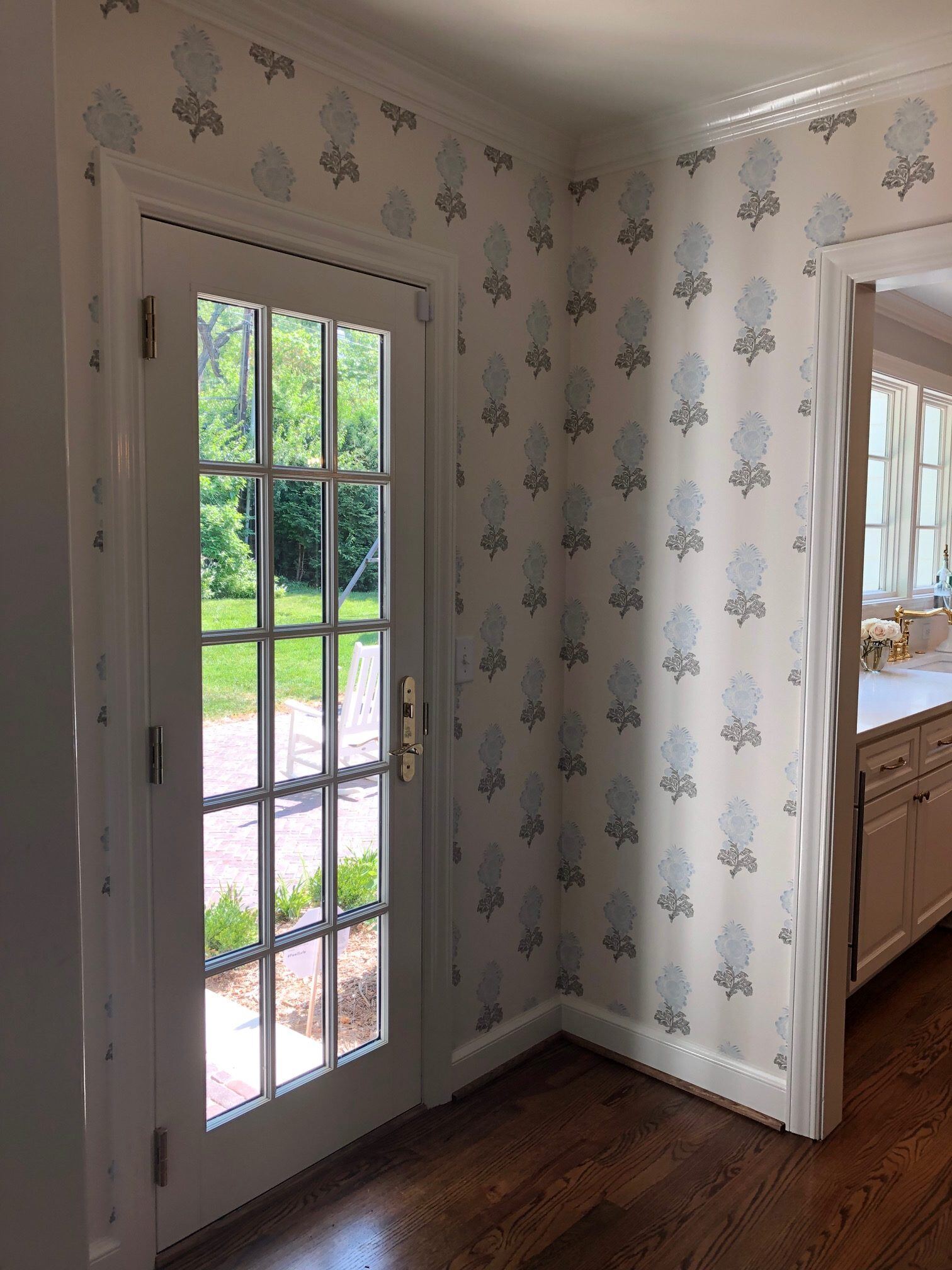
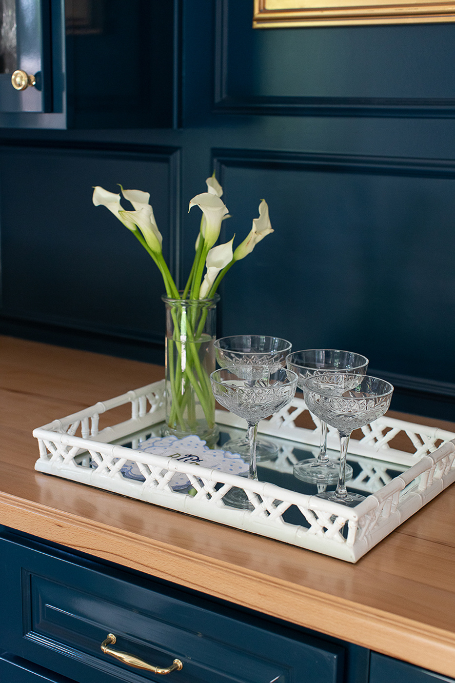
This is one of those spaces that’s beautiful bare and un-styled. But anytime you get the chance to have Jenny Steffens Hobick style a space, you take it! This little bar now features some beautiful artwork from her Westwood Hills shops. It sits just beneath a picture light from Visual Comfort. Opposite the bar is a Marvin french door that leads out to a brick patio.
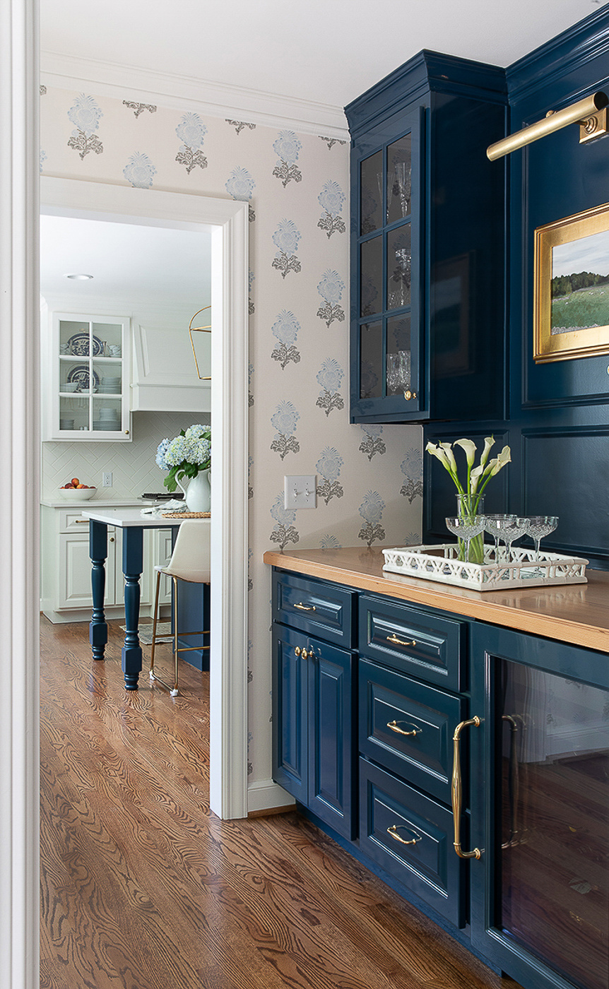
You can see just how perfectly placed this room is. Stay tuned for a deep dive blog post on the kitchen, pantry, laundry room and powder bath!
-
When a Scovell client buys a Scovell House
-
A Proper Kitchen for a Proper Family
-
Make it functional. And pretty, too.
-
A Family-Sized Kitchen
